
Figures & data
Table 1. Values are obtained from [Citation21].
Table 2. Parameters used for the thermal and drug modules, obtained from literature.
Figure 1. Anatomical model used in this study, based on the organ models generated by the XCAT phantoms. Panels (A) and (B) show the front and back of the model, visualizing the organs and vasculature. Panel (C) visualizes the location of the inflow (red) and outflow (blue) catheters used in this study. The two inflow two outflow catheter setup was based on that used by Rettenmaier et al. [Citation8].
![Figure 1. Anatomical model used in this study, based on the organ models generated by the XCAT phantoms. Panels (A) and (B) show the front and back of the model, visualizing the organs and vasculature. Panel (C) visualizes the location of the inflow (red) and outflow (blue) catheters used in this study. The two inflow two outflow catheter setup was based on that used by Rettenmaier et al. [Citation8].](/cms/asset/de63d2b0-4974-4ba6-8a9f-0b2e7ebfdf08/ihyt_a_2218627_f0001_c.jpg)
Table 3. Case setup representing the treatment strategies used in this study.
Figure 2. Comparison between the simulated mild, moderate and severe treatment strategies compared to the clinically measured mean minimum, maximum and average values, extracted from 34. Panels (A–E) show the thermal profile for the upper abdominal (right and left), mid-abdominal (right and left) and suprapubic regions, respectively. The median values are represented by the solid black line with symbols and the red, orange and yellow shaded areas represent the interquartile ranges in that region for the severe, moderate and mild treatment strategies, respectively. The gray shaded area and black horizontal lines reflect the measured ranges and the average steady state value. Overall, the steady-state temperature values reported by Rettenmaier et al. [Citation8] and the simulated temperature were similar. The increased flow rate and high(er) inflow temperature may account for some of the fluctuations that occurred during the treatment.
![Figure 2. Comparison between the simulated mild, moderate and severe treatment strategies compared to the clinically measured mean minimum, maximum and average values, extracted from 34. Panels (A–E) show the thermal profile for the upper abdominal (right and left), mid-abdominal (right and left) and suprapubic regions, respectively. The median values are represented by the solid black line with symbols and the red, orange and yellow shaded areas represent the interquartile ranges in that region for the severe, moderate and mild treatment strategies, respectively. The gray shaded area and black horizontal lines reflect the measured ranges and the average steady state value. Overall, the steady-state temperature values reported by Rettenmaier et al. [Citation8] and the simulated temperature were similar. The increased flow rate and high(er) inflow temperature may account for some of the fluctuations that occurred during the treatment.](/cms/asset/0c9a9a17-06a1-47f2-be45-dd4148424031/ihyt_a_2218627_f0002_c.jpg)
Figure 3. Visualization of the change in core body temperature (A), perfusate drug concentration (B), plasma drug concentration (C) and ratio of perfusate concentration over plasma concentration (D). Core body temperatures are visualized for the mild (yellow), moderate (orange) and severe (red) treatment strategies. Dashed lines (A) and the blue shaded region (D) represent literature values, as shown in . The inflow concentration, and therefore the perfusate curve (B), was determined based on the average values presented in [Citation31]. A more detailed comparison between the predicted core values and those reported in the literature is shown in .
![Figure 3. Visualization of the change in core body temperature (A), perfusate drug concentration (B), plasma drug concentration (C) and ratio of perfusate concentration over plasma concentration (D). Core body temperatures are visualized for the mild (yellow), moderate (orange) and severe (red) treatment strategies. Dashed lines (A) and the blue shaded region (D) represent literature values, as shown in Table 4. The inflow concentration, and therefore the perfusate curve (B), was determined based on the average values presented in [Citation31]. A more detailed comparison between the predicted core values and those reported in the literature is shown in Table 4.](/cms/asset/c43437e4-efa5-4ac2-b368-52e6389cd8ea/ihyt_a_2218627_f0003_c.jpg)
Table 4. Comparison of simulated core temperatures and chemotherapy concentration with literature values.
Figure 4. Influence of treatment strategies on the peritoneal surface. Panel (A) shows the CEM43 level of which 10% of the peritoneal surface is above (). Panel (B) shows the median temperature on the peritoneal surface. Panel (C) shows the percentage of the peritoneal surface that reached 41 °C during the treatment. Aggressive treatment strategies, including heating (for a period of time) at 43 °C, increase both the thermal dose and the percentage that has been treated with 41 °C.
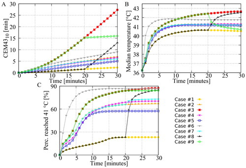
Figure 5. Predicted volumetric value in the different peritoneal organs. The green curves represent the step-down approach and the black curves represent the step-up approach. All curves show that the step-down approach results in a higher thermal dose, indicating a higher risk of thermal damage in the various peritoneal organs.
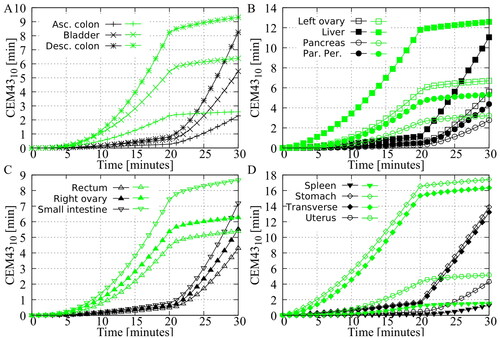
Figure 6. Demonstration of the need for patient specific optimization by combining preclinical in vitro data, based on the work of Helderman et al. [Citation4], with the thermal distributions generated in this study. The cumulative thermal enhancement ratio (TER) is visualized for all cases. Whiskers represent the 10th and 90th percentiles, boxes represent the interquartile range, and the mean is represented by the black bar. Differences between the cases may increase or decrease depending on cell type and chemotherapy. Overall, Case #6 provides the most homogeneous distribution of thermal enhancement.
![Figure 6. Demonstration of the need for patient specific optimization by combining preclinical in vitro data, based on the work of Helderman et al. [Citation4], with the thermal distributions generated in this study. The cumulative thermal enhancement ratio (TER) is visualized for all cases. Whiskers represent the 10th and 90th percentiles, boxes represent the interquartile range, and the mean is represented by the black bar. Differences between the cases may increase or decrease depending on cell type and chemotherapy. Overall, Case #6 provides the most homogeneous distribution of thermal enhancement.](/cms/asset/882b2cbe-06c8-4e59-abec-8a1ff2494777/ihyt_a_2218627_f0006_c.jpg)
Data availability statement
The raw data supporting the conclusions of this article will be made available by the authors upon request.