
Figures & data
Figure 1. Analysis of HSP-related genes. (A) PPI network constructed based on HSP-related genes. Circles represent genes and lines represent interactions. (B) CNV chromosome representation of HSP-related genes. The dots corresponding to the gene names indicate the specific location of the gene on the chromosome.
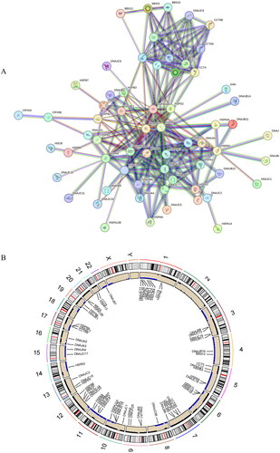
Figure 2. Construction of the prognostic model.(A) LASSO coefficient spectrum obtained from LASSO regression. Based on the graph, the optimal λ value is selected. The two dashed lines indicate two specific λ values: lambda.min and lambda.1se. The lambda.1se model is the simplest as it utilizes fewer genes, while lambda.min achieves slightly higher accuracy by incorporating a slightly larger number of genes. In this case, lambda.min is chosen for further analysis. (B) Coefficient distribution plot generated for the logarithm (λ) sequence in the LASSO model. Each curve in the figure represents a gene, the ordinate is the coefficient of the gene, and the abscissa is log(λ). (C) Forest plot of the multivariate Cox regression model, including 12 prognostic model genes and their corresponding coefficients. Hazard ratio (HR) > 1, Risk factors; HR < 1, Protective factors. *indicates P < 0.05; **indicates P < 0.01; ***indicates P < 0.001.
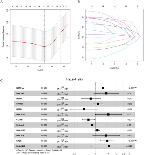
Table 1. Results of univariate Cox regression analysis.
Figure 3. Performance evaluation and validation of the CRC prognostic model in TCGA. (A) Distribution of Riskscore in high/low-risk group patients in TCGA. The high-risk group is indicated on the right of the dotted line and the low-risk group on the left of the dotted line. (B) Distribution of survival status in high/low-risk group patients in TCGA. The dashed line on the right represents the high-risk group, while the dashed line on the left represents the low-risk group. Each data point represents an individual patient. The red dots indicate patients who experienced death at the corresponding time point, while the green dots represent patients who were still alive at the corresponding time point. (C) Heatmap depicting the expression levels of prognostic genes in high/low-risk groups of patients in TCGA. The red line represents gene expression up-regulation, while the green line represents gene expression down-regulation. (D) Survival curve analysis of high/low-risk group patients in TCGA. (E) ROC curves demonstrating the accuracy of the model in predicting 1-year, 3-year, and 5-year survival in CRC patients. The X-axis represents the specificity of the model, while the Y-axis represents the sensitivity of the model. The larger the AUC, the higher the sensitivity and specificity of the model. Therefore, a larger AUC value indicates a higher level of sensitivity and specificity in the model.
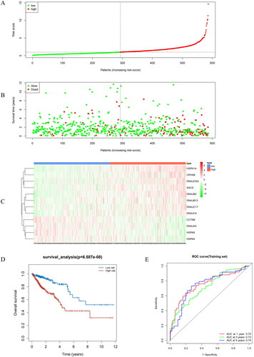
Figure 4. Performance evaluation and validation of the prognostic model in the GEO validation set. (A) Distribution of Riskscore in high/low-risk group patients in the GEO validation set. The high-risk group is indicated on the right of the dotted line and the low-risk group on the left of the dotted line. (B) Distribution of survival status in high/low-risk group patients in the GEO validation set. The dashed line on the right represents the high-risk group, while the dashed line on the left represents the low-risk group. Each data point represents an individual patient. The red dots indicate patients who experienced death at the corresponding time point, while the green dots represent patients who were still alive at the corresponding time point. (C) Heatmap illustrating the expression levels of prognostic genes in high/low-risk groups of patients in the GEO validation set. The red line represents gene expression up-regulation, while the green line represents gene expression down-regulation. (D) Survival curve analysis of high/low-risk group patients in the GEO validation set. (E) ROC curves demonstrating the accuracy of the model in predicting 1-year, 3-year, and 5-year survival in CRC patients. The X-axis represents the specificity of the model, while the Y-axis represents the sensitivity of the model. The larger the AUC, the higher the sensitivity and specificity of the model. Therefore, a larger AUC value indicates a higher level of sensitivity and specificity in the model.
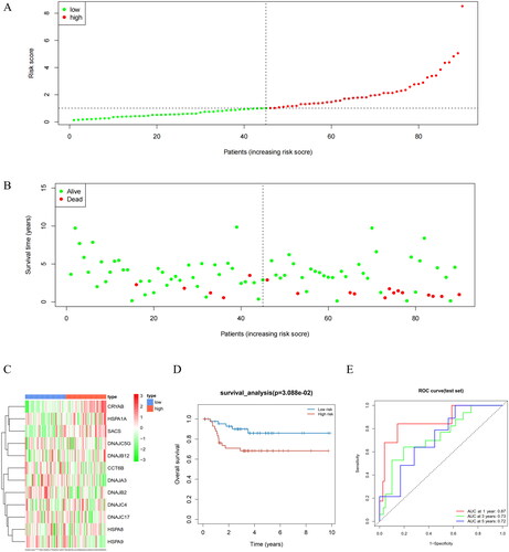
Figure 5. Differences in Riskscore among patients in T, N, M, and different stages. Different clinical features were divided into 2 stages. P < 0.05 represents a significant difference. For example, there is a significant difference in Riskscore between T1 + T2 and T3 + T4 patients.
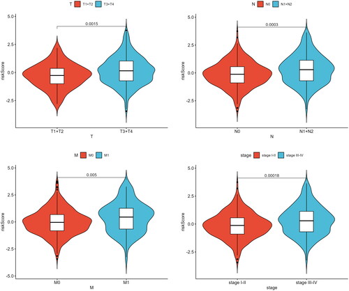
Figure 6. Independent prognostic analysis of Riskscore and nomogram assessment. (A) Results of univariate Cox regression analysis for different features. Hazard ratio (HR) > 1, Risk factors; HR < 1, Protective factors. (B) Results of multivariate Cox regression analysis for different features. (C) Nomogram of the prognostic model score combined with clinical information. Column line plots are generated by constructing a multivariable regression model to assess the contribution of various influencing factors (magnitude of regression coefficients) on the outcome variable. Each level of each influencing factor is assigned a score based on its impact within the model, and these scores are then summed to obtain a total score. Finally, using the functional transformation relationship between the total score and the probability of the outcome event, the predicted value for the occurrence of the outcome event for an individual is calculated. (D-F) Calibration curves of the nomogram to predict 1-year, 3-year, and 5-year risk. The calibration curve is a scatter plot of the actual occurrence rate versus the predicted occurrence rate. It is used as an indicator to evaluate the accuracy of the column line plot predictions.
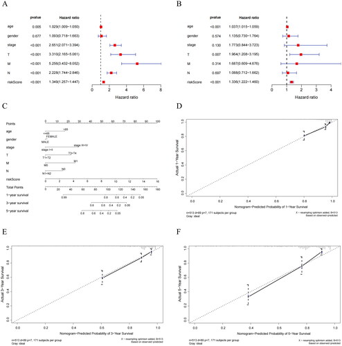
Figure 7. Biological differences analysis between high- and low-risk groups. (A) GO annotations of DEGs between high/low-risk groups. (B) KEGG enrichment analysis of DEGs between high/low-risk groups. The vertical axis represents each function or pathway, the horizontal axis represents the Gene Ratio corresponding to each function or pathway, bubble size indicates the number of genes enriched in the function or pathway, and bubble color represents the P-Value.
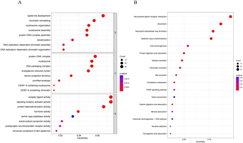
Figure 8. Analysis of immune cell abundance and immune function in high- and low-risk groups. (A) Expression levels of immune cells in two groups. (B) Levels of immune function in two groups. *indicates P < 0.05; **indicates P < 0.01; ***indicates P < 0.001; ns indicates P > 0.05.
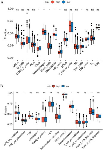
Figure 9. Analysis of immune checkpoint expression and prediction of immune response to therapy. (A) Levels of immune checkpoint expression between two risk groups. (B) Differential assessment of TIDE scores in two risk groups. *indicates P < 0.05; **indicates P < 0.01; ***indicates P < 0.001; ns indicates P > 0.05.
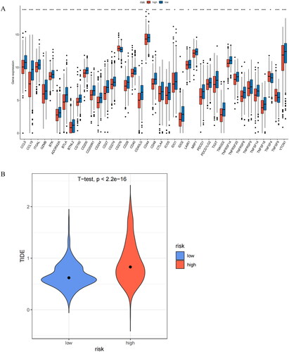
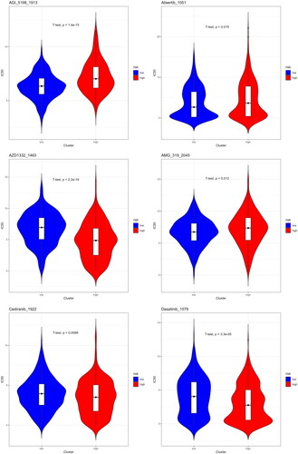
Figure 10. Sensitivity analysis of high- and low-risk groups to different drugs. The lower the IC50 value of a drug, the better its therapeutic efficacy.
Supplemental Material
Download Zip (1.8 MB)Data availability statement
The data used to support the findings of this study are available from the corresponding author upon request.