Figures & data
Table 1. Overview of univariate and multivariate outlier detection methods addressed.
Figure 1. Top: Estimates of the Gini coefficient (left) and variance of the Gini coefficient (right) for the Albanian data set after univariate outlier detection methods as well as outlier imputation have been applied. Bottom: Share of upper and lower outliers for each outlier detection scheme applied to the Albanian data set.
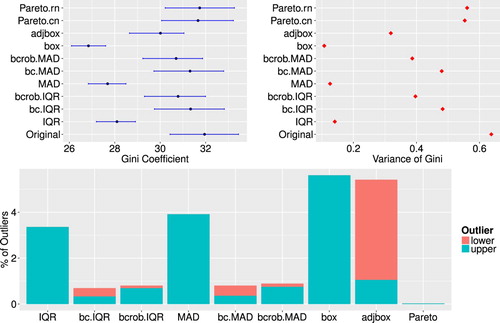
Figure 2. Top: Estimates of Gini coefficient (left) and variance of Gini coefficient (right) for the Albanian data set after multivariate outlier detection methods as well as outlier imputation have been applied. Bottom: Share of outliers detected by multivariate outlier detection methods for the Albanian household data.
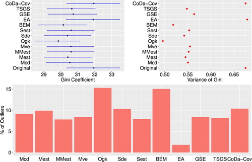
Figure 3. Estimated Gini coefficients for different levels of ε and different outlier detection methods. The dashed line indicates a baseline representing the median of the Gini coefficients of the uncontaminated data.
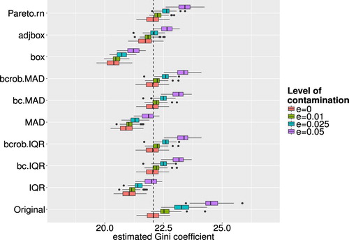
Figure 4. Boxplots of successfully detected artificial outliers, where the whole observation was contaminated, for different outlier detection methods and different levels of ε.
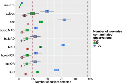
Figure 5. Boxplots of successfully detected artificial outliers, where only single cells were contaminated, for different outlier detection methods and different levels of ε.
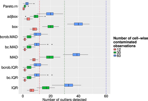
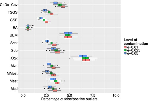
Figure 6. Share of false/positive outliers to number of clean data points for different outlier detection methods and different levels of ε.
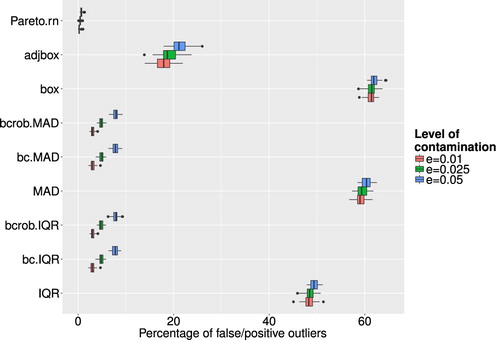
Table 2. Percentages of misclassified observations for different levels of ε for the univariate methods.
Figure 7. Boxplots of calculated Gini coefficients for different outlier detection methods and different levels of ε. The dashed line indicates a baseline representing the median of the Gini coefficients of the uncontaminated data.
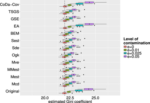
Figure 8. Boxplots of successfully detected artificial outliers, where the whole observation was contaminated, for different outlier detection methods and different levels of ε.
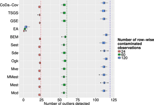
Figure 9. Boxplots of successfully detected artificial outliers, where only single cells were contaminated, for different outlier detection methods and different levels of ε.
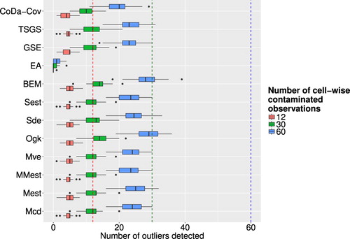
Figure 10. Boxplots of share of false/positive outliers to number of clean data points for different outlier detection methods and different levels of ε.