Figures & data
Table 1. Proteins and their phosphorylation sites.
Figure 1. Graphical model representation of the new hierarchically coupled Bayesian regression model. The mathematical details can be found in Section 3.1. Free (hyper-)parameters are in white circles. The data and fix hyperparameters are in gray circles. The two boxes indicate the experimental conditions and the covariate-specific coupling parameters
.
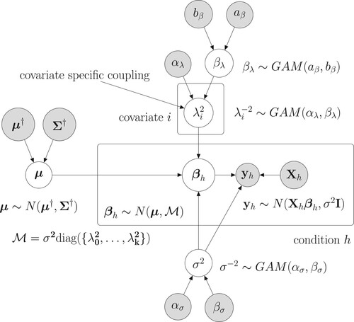
Table 2. Overview of the 8 data imputation methods that we considered in our study.
Table 3. List of the (hyper-)prior distributions along with the selected fix hyperparameters.
Figure 2. Raw data: Boxplots of the logarithmic predictive probabilities (PPs), obtained by leave-one-out-cross validation (LOOCV-PPs). For each of the four NH-DBN models (DBN, UC, GLOBAL and NEW) there is a separate panel. And within each panel there are 9 boxplots that refer to the 9 data interpolation methods for missing data (see Table ). Each of the 36 boxplots displays the distribution of 18 predictive probabilities (one for each left-out data point). The black horizontal lines mark the largest boxplot median, which was achieved by the new NH-DBN model (NEW) in combination with smoothing splines (SP). Relevant pairwise comparisons of the log LOOCV-PPs can be found in Figures and .
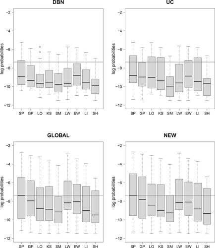
Figure 3. Comparing the data imputation methods; cf. Table . Boxplots of the absolute LOOCV-PP values have been provided in Figure . The 32 boxplots of this figure refer to the relative LOOCV-PP differences in favor of the smoothing splines interpolation method (SP). For each of the four NH-DBN models (DBN, UC, GLOBAL and NEW) there is a separate panel. Within each panel there are 8 boxplots showing the pairwise differences in the logarithmic predictive probabilities in favor of the smoothing splines (SP). The black horizontal lines mark the zero line. For the data imputation methods behind the abbreviations we refer to Table . It can be seen that all differences are consistently in favor of the smoothing splines (SP).
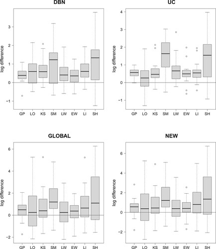
Figure 4. Comparing the four NH-DBN models. Boxplots of the absolute LOOCV-PP values were provided in Figure . The 27 boxplots of this figure refer to the pairwise relative LOOCV-PP differences in favor of the newly proposed NH-DBN (NEW). There are 9 panels, one for each data interpolation method. Within each panel there are three boxplots showing the relative differences in the logarithmic predictive probabilities in favor of the newly proposed NH-DBN model (NEW). Left boxplot: NEW vs. DBN, center boxplot: NEW vs. UC and right boxplot: NEW vs. GLOBAL. In each panel a black horizontal line marks the zero line. It can be seen that all differences are consistently in favor of the newly proposed NH-DBN (NEW).
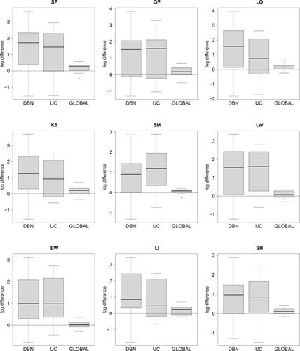
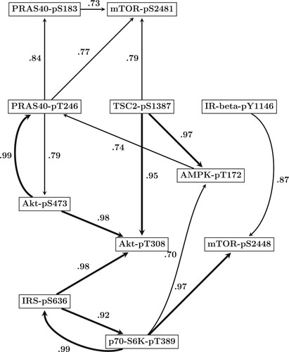
Figure 5. Predicted mTOR protein signaling pathway. Based on the results of our comparative evaluation study in Section 5.1, we employed the newly proposed hierarchical Bayesian model from Section 3.1 (NEW) in combination with smoothing splines (SP) to infer the structure of the mTOR pathway from all data points. By running a RJMCMC for each site we posterior sampled the site-specific regulator sets (subsets of the n = 10 other sites). The marginal network interaction probability for the interaction
refers to the proportion of posterior sampled covariate sets of site
that contained site
as covariate. Shown are the 16 regulatory interactions whose probabilities exceeded the threshold of 0.7. Interactions whose probabilities exceeded the more conservative threshold of 0.9 are displayed by bold edges.