
Figures & data
Table 1. Four possible combinations of problem solving progress and insight that can be detected by the dynamometer.
Table 2. Descriptive statistics for each problem type.
Figure 1. Insights for self-report (top level) and dynamometer (bottom level) for the different problem types. The figure illustrates that the incidence of self-reported insights and those captured by the dynamometer converge (i.e. show a similar pattern). Blue circles represent individual participants with a random horizontal jitter to aid visualisation. Error bars represent 95% confidence intervals.
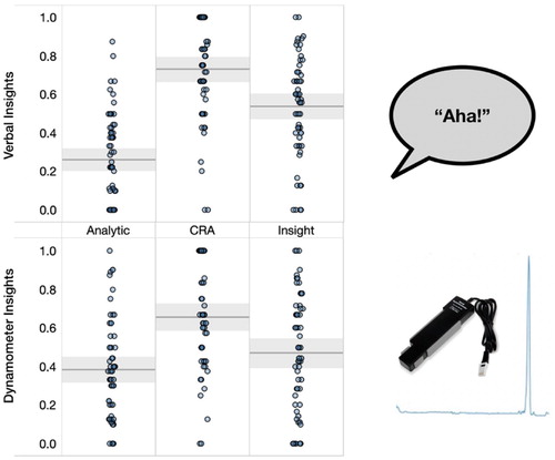
Figure 2. Average slope size by problem type. A greater slope in the dynamometer pattern indicates that the participant experienced more metacognitive progress towards solution. Solutions to analytic problems tended to follow from greater perceived progress (illustrative example provided on the bottom-left of the figure), compared to insight and CRA problems. Blue circles represent individual participants with a random horizontal jitter to aid visualisation. Shading represents 95% confidence intervals.
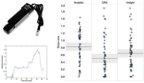
Figure 3. The proportion correct of Aha and No Aha responses, split between verbal-report (left) and the dynamometer (right). Blue circles represent individual participants with a random horizontal jitter to aid visualisation. Shading represents 95% confidence intervals.
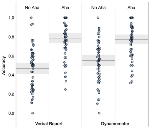
Figure 4. Left: Regression plot with Aha intensity on the x-axis and accuracy on the y-axis. Right: Regression plot with Aha intensity on the x-axis and confidence on the y-axis. Shading represents 95% confidence intervals; grey lines represent (participant) random effects.
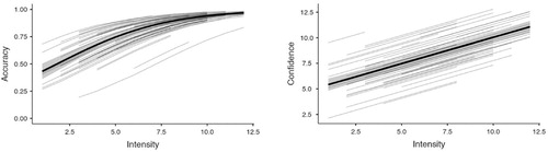
Figure 5. Left: Regression plot for creative problems with slope size on the x-axis and accuracy on the y-axis. Right: Regression plot for analytic problems with slope size on the x-axis and accuracy on the y-axis. Shading represents 95% confidence intervals; grey lines represent (participant) random effects.
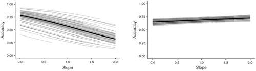
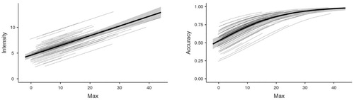
Figure 6. Left: Regression plot with maximum dynamometer ratings on the x-axis and Aha intensity on the y-axis. Right: Regression with maximum dynamometer ratings on the x-axis and accuracy on the y-axis. Shading represents 95% confidence intervals; grey lines represent (participant) random effects.
Data availability statement
The data that support the findings of this study are openly available in the Open Science Framework at https://osf.io/w7kyc/.