
Figures & data
Figure 1. Acoustic characteristics of nonverbal vocalisations produced in 10 behavioural contexts. Acoustic measures are broken down by speaker sex. Min. = minimum, Max. = maximum, SCoG = Spectral center of gravity, dB = decibel, Hz = Hertz, sec = seconds.
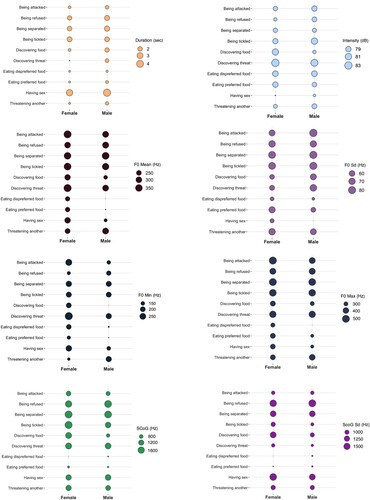
Table 1. Acoustic characteristics of vocalisations as means per behavioural context with standard deviations in brackets.
Table 2. D-prime scores indicating participants’ performance in matching vocalisations to behavioural contexts, tested against chance level.
Figure 2. Heatmap of confusion matrix (%) for behavioural context categorisation.
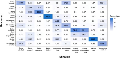
Figure 3. Raincloud graph for (A) d prime scores (Experiment 1b), (B) arcsine Hu scores (Experiment 2). Raincloud graphs combine split-violin plots and boxplots: split-violin plots show the data distribution, and boxplots display the range of the data, their full range from minimum to maximum, the 25–75% range (box), and the median (middle of the box). Horizontal dashed lines indicate the chance level for each experiment. In both experiments, listeners performed better than chance for all contexts, with the exception of eating dispreferred food in Experiment 1b (A). Code adapted from Allen et al. (Citation2019).
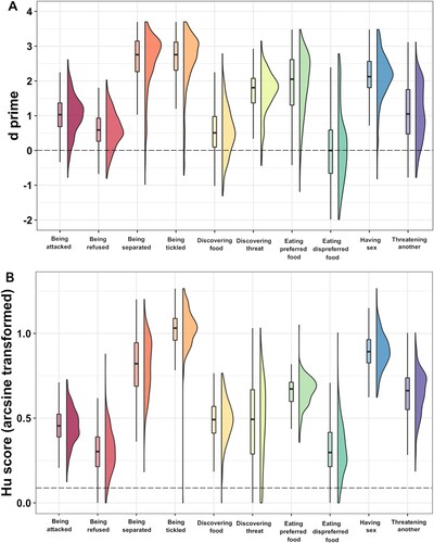
Table 3. Hu scores indicating listeners’ performance in categorising contexts, tested against chance level.
Figure 4. Raincloud graph for (A) d prime scores (Experiment 1b), (B) arcsine Hu scores (Experiment 2). There was no difference in d scores between positive and negative contexts in Experiment 1b (A). Listeners were better at recognizing positive contexts compared to negative contexts in Experiment 2 (B).
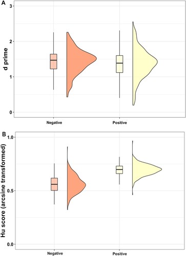
Table 4. Comparisons of the frequency of choosing the target category with the frequency of choosing the most confused category for each context.
SupplementaryMaterials_07_11.docx
Download MS Word (2.6 MB)Data availability statement
The data that support the findings of Experiment 1b are openly available from https://doi.org/10.21942/uva.13560374
, and the data that support the findings of Experiment 2 are openly available from https://doi.org/10.21942/uva.18972962 .