Figures & data
FIG. 1 Proposed NCORE Program. Figure courtesy of Richard Scheffe (CitationU.S. EPA 2004b).
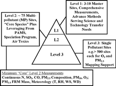
FIG. 2 PM2.5 concentration and chemical composition at various sites in North America (CitationBlanchard 2004). Chemical species for each site are presented clockwise in the pie charts in the same order as in the legend. Reprinted from Chapter 6, –16 of the Final NARSTO Report with permission from Cambridge University Press. Copyright 2004 Envair.
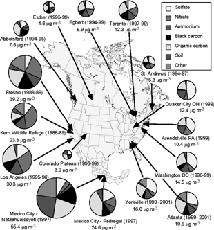
FIG. 3 Increased mortality rate ratios due to fine particles (FP), which are particles less than 2.5 microns in aerodynamic diameter, and sulfate particles from the Harvard Six-Cities Study (CitationDockery et al. 1993). Concentrations on the x-axis are given in μ g/m3. The y-axis shows the ratio of the death rate in each city (deaths/year normalized by population) to the lowest death rate measured, namely that in Portage, Wisconsin. Reprinted with permission from New Engl. J. Med. 329:1753–1759, 1993. Copyright 1993, Massachusetts Medical Society. All rights reserved.

FIG. 4a Reduction in concentrations of black smoke in Dublin, Ireland, following a city-wide ban on sales of coal (CitationClancy et al. 2002). Reprinted with permission from Elsevier (Lancet. 360:1210–1214, 2002).
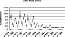
FIG. 4b Reduction in cardiovascular mortality in Dublin, Ireland, following a city-wide ban on sales of coal (CitationClancy et al. 2002). The y-axis shows deaths per 1000 person years. Reprinted with permission from Elsevier (Lancet. 360:1210–1214, 2002).
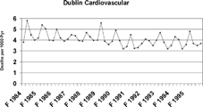
TABLE 1 Global emissions of PM2.5 (CitationScheffe 2003)
FIG. 5 1999 National emissions in the U.S. This figure was prepared by R. Scheffe from data in Chapter 4, Table 4.3 of the Final NARSTO Report (CitationHidy and Pace 2004) and natural emission data from CitationU.S. EPA (1998). No data from natural sources are included for PM2.5 or PM10. Data from the NARSTO Report are used with permission from Cambridge University Press, Copyright 2004 Envair.
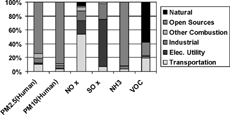
FIG. 6 Anthropogenic sources of PM2.5 according to the national emission inventory for 2001. Figure courtesy of Andy Miller (Redawn from CitationMiller 2003). All values are given in Ktons (thousand English tons) per year. Data available from http://www.epa.gov/ttn/chief/trends/.
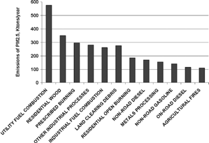
FIG. 7 Percentage of the population at different locations as a function of time on a typical workday, presented in the form of a stacked vertical chart. Data are taken from CitationOtt (1995) and pertain to California. Printed with permission from J. Exposure Analysis and Environ. Epidemiol. 5:449–472, 1995. Copyright 1995, Macmillan Publishers Ltd.
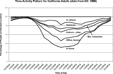
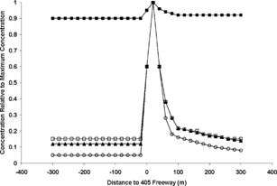
FIG. 8 Airborne concentrations relative to the maximum concentration for several species as a function of distance from a major freeway (CitationZhu et al. 2002a). Upwind is to the left of 0, while downwind is to the right. The symbols refer to the following species: black squares (PM), white squares (particle number), black triangles (black carbon), and white circles (carbon monoxide). Reprinted with permission from the Air and Waste Management Association.