Figures & data
Table 1. Demographic information of the entire population included in this study.
Figure 1. Example of scatterplots of differences versus averages for ‘Gray-level co-occurrence matrix – Average (GLCM – Average)’ (A and B) and ‘Gray-level distance-zone matrix – Intensity Non-uniformity (GLDZM – IN)’ (C and D) in which the 95% boundaries of smallest detectable change are indicated with a dashed line. Log transformation of the data was needed for the bottom feature. The left two plots indicate the absolute delta radiomic features and the right two plots the relative delta radiomic features.
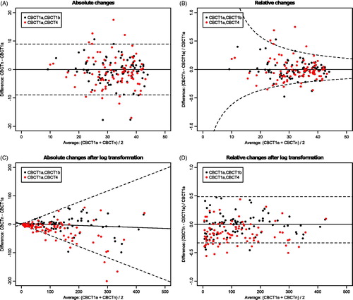
Figure 2. Example for the change of features over time for all patients in the cohort. Dashed lines indicate the calculated thresholds of the smallest detectable change (C) and each line represents a patient. For some patients, the line exceeds C during treatment, meaning that there was a change larger than expected by chance.
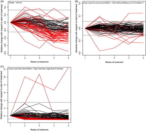
Figure 3. Number of features that change for an ‘x’ number of patients.
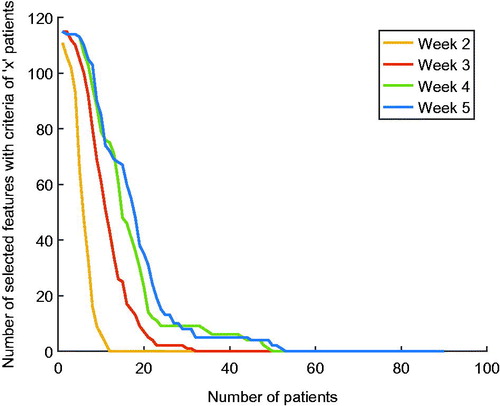
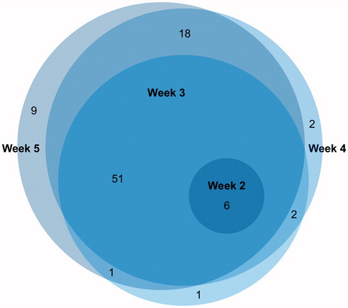
Figure 4. Overlap between delta radiomic features that change after 1 week, 2 weeks, 3 weeks and 4 weeks after the start of treatment.