Figures & data
Table 1. The symptoms studied, and the related prevalence (N (%)) for specific symptom cut-offs.
Figure 1. An illustration of the segments division in the generated 2D maps. Left and right sectors are combined to create the different posterior sectors: posterior, posterior upper, posterior central and posterior lower. Note: lateral edges represent the posterior line of the rectum.
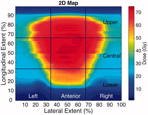
Figure 2. (Left panel) 2D dose map for one of the patients presenting defecation urgency (2) symptoms, and the associated spatial dose metrics of the extent-based model. (Right panel) Dose–response curves for defecation urgency (2) the best area-based (red) and extent based (black) models; confidence intervals in the observed data are given by the 95% binomial confidence intervals. Note: dose–response curves for the remaining symptoms and for the DSH/DVH-based models in the Supplementary Material.
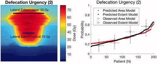
Table 2. An overview of the final spatial- and DSH/DVH-based MVA models for each studied symptom.
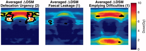
Figure 3. Average difference 2D maps for the three symptoms where areas of significant dose difference were found based on the permutation analysis. Note: areas enclosed by the white contours refer to significance on the 5% level, whereas black contours to the 10% significance level.