Figures & data
Figure 1. The three most variable components of the principal component analysis (PCA) of the gene expression profiles. (a) All genes of the Affymetrix platform are considered and (b) only genes from the 256 gene signature (CIT) are considered. The distinction between the basal-like and the more heterogeneous luminal subtypes is clearly illustrated by the PCA plot, even before selecting for the CIT gene signature.
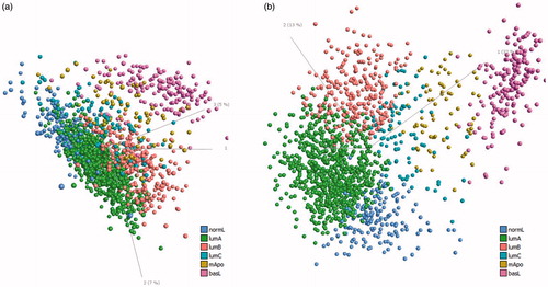
Figure 2. (a) Violin and box plots of the age distribution at the time of diagnosis (y-axis) of molecular subtypes (x-axis). (b) Violin and box plots of the tumor size (y-axis) of molecular subtypes (x-axis). (c) Relative frequency distribution chart of disease stage (x-axis) and relative frequency of occurrence (y-axis). The chart is shown separately for each subtype. (d) Violin and box plots of age distribution at the time of diagnosis (y-axis) of BRCA1/2 carriers and non-carriers (x-axis). VUS: variant of unknown significance. (e) Violin and box plots of tumor size (y-axis) of BRCA1/2 carriers (x-axis). (f) Relative frequency distribution chart of disease stage (x-axis) and the relative frequency of occurrence (y-axis). The chart is shown separately for group of patients (carriers and non-carriers).
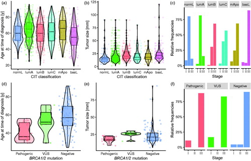
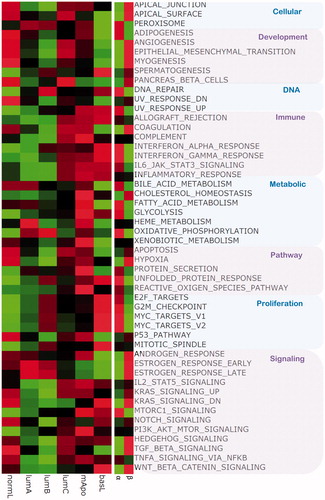
Figure 3. Heatmap of scaled mean expression values of molecular subtypes for each hallmark gene set. Expressions level of genes contained in each hallmark and the expressions of all samples from each subtype are aggregated, by the mean value. The color ranges from bright green for the lowest expression values to bright red for the highest. Heatmap of the scaled mean expression values of patients above 60 years of age (BRCA1/2 non-carriers, assigned α) and BRCA1/2 carriers, assigned β, for each hallmark gene set. Expressions of genes contained in each hallmark and expressions of samples from each group are aggregated, by the mean value. The color ranges from bright green for the lowest expression values to bright red for the highest.