Figures & data
Table 1. Patient characteristics.
Table 2. Treatment practices among healthcare districts, N (%).
Figure 1. The incidence per year for the whole cohort is shown.
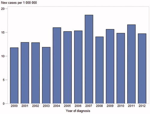
Figure 2. Five healthcare districts and major industrial plants. Shipyards are depicted by green pentagons and major asbestos mining locations by orange circles.
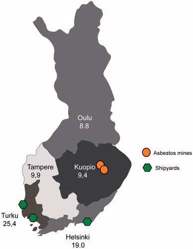
Table 3. Occupational aspects among healthcare districts, N (%).
Figure 3. Kaplan–Meier curve representing survival of a group treated with chemotherapy versus a group without chemotherapy treatment. *Survival is zero for patients whose disease was diagnosed at autopsy; hence, the vertical line at the beginning of the Kaplan–Meier curve.
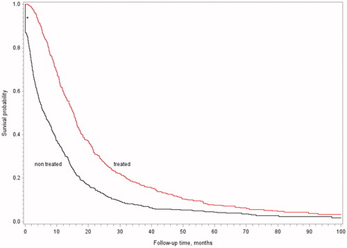
Figure 4. Kaplan–Meier curve representing survival of a group treated with pemetrexed versus a group treated with other cytostatic agents.
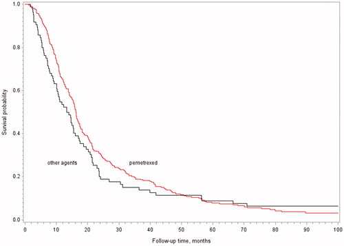
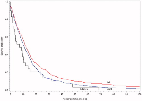
Figure 5. Kaplan–Meier curve representing survival in terms of the side of mesothelioma.