
Figures & data
Table 1. ‘Ideal’ OAR constraints from the ILROG proton guidelines [Citation9].
Figure 1. Dose distribution of selected proton and photon plans for each case. The dose is shown as dose color wash from 50% to 110% as indicated by the scales shown to the left side. CTVs are shown as red contours and the beam angles are represented by the yellow lines.
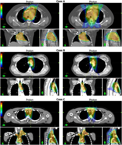
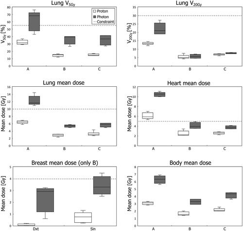
Figure 2. Boxplots of dose to OARs for all proton and photon plans. The horizontal line represents the median, the boxes the interquartile range, and the whiskers the min/max values. OAR constraints are shown by the dotted horizontal lines. The breast mean dose (lower left corner) is shown for case B only, while the dose to the other OARs is shown for all cases (labelled A, B, and C). All metrics are statistically significantly different except lung V20Gy for patient B.
Data availability statement
The data that support the findings of this study are available from the corresponding author, upon reasonable request.