Figures & data
Table 1. Participant table with demographic, professional, and song stream information.
Figure 1. Screenshot from Spotify for Artists, “Made to Be Found,” explaining how recommendations are made.
The image shows white text on a purple background. The text reads: “It takes a lot of data to make a great recommendation. We draw upon a multidude of signals to connect the right song to the right ears at the right time. Some of these signals include: time of dat, temppo, genres, listening habits of fans with similar tstes,and newness. We think of it like this: if your music is similar to anohter song, and a listener really likes that song, there’s a good chane they’ll like yours too. It’s like having a personal DJ always on the lookout for the next song your fans will love“.
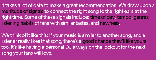
Figure 2. Screenshot from Spotify for Artists website (“How they made it”).
Image shows heading “How they made it” and 3 images of artists. the first Artist image shows a person standing on a beach at sunset. The second image shows a person sitting at a piano near a window, with shadows cast behind them. The third image shows a close up of artist Dreezy’s face. They have long nails and are wearing a thick chain necklace.
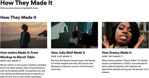
Figure 3. Screenshot from Spotify for Artists (2023) describing the S4A dashboard.
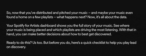
Figure 4. Audience tab showing listener data from P9’s Spotify for Artists Dashboard.
White background with back text that shows audience “stats this period” below that the text listeners: 75,120, streams 135,355.
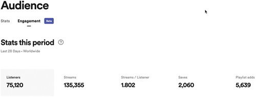
Figure 5. Source of streams data from P9’s Spotify for Artists Dashboard.
Image shows a simple bar graph, with blue bars on a white backgrouns. Listener’s own plplaylist and library category as the highest streams with 37%.
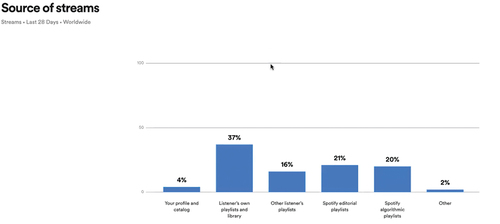
Figure 6. Source of listens from editorial playlists, data from P2’s S4A dashboard.
This screen shows 4 thumbnail images of editorial playlists such as “global groove” and “state of jazz” on the left hand side, and streaming numbers on the right hand side.
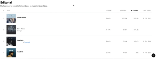
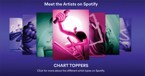
Figure 7. “Meet the Artists” showing the Chart Toppers group of artists, screenshot from Loud & Clear.
Purple background with a carousel of images. The main image is a pink cartoon character of a person climbing a ladder and holding a micophone.