Figures & data
Figure 1 Map showing the location of different regions in New Zealand used for the analysis. Note that these regional boundaries are those defined by Statistics New Zealand in 1961. n t =total number of births in dataset; n y =average number of births per year.
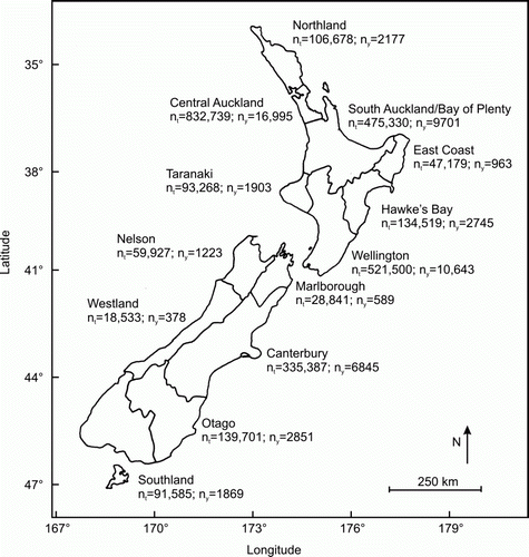
Figure 2 The relationship across regions between the mean annual ambient temperature and average proportion of male births (both averaged over 1961–2009). Error bars are 95% confidence intervals.
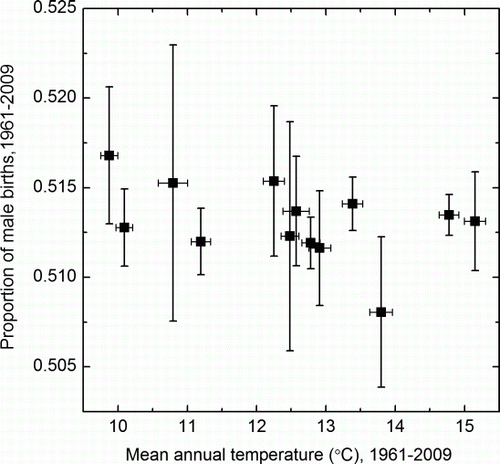
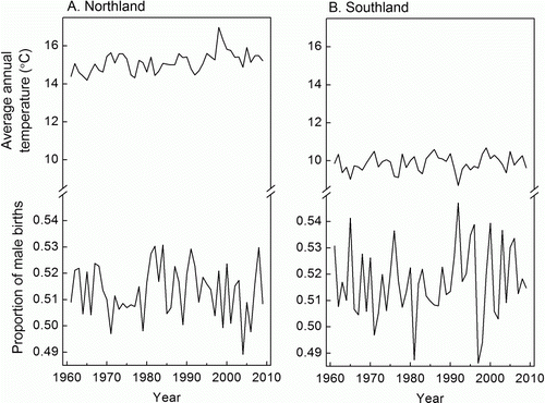
Figure 3 Time series of the proportion of male births and average annual ambient temperature in two contrasting New Zealand regions. A, The warmest region, Northland (overall mean ambient temperature of 15.15 °C). B, The coldest region, Southland (overall mean ambient temperature of 9.87 °C).