Figures & data
Table 1 Configurations of the models used in this study.
Figure 1 The SAO index. A, For NCEP reanalysis data (black solid line) and each of the PMIP2 models' PI (solid lines) runs. B, For the PMIP2 models' PI (solid lines) and LGM runs (dashed lines). The colour key for the models is CCSM3, blue; FGOALS, green; HadCM3M2, red.
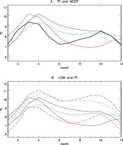
Figure 2 The annual (A–C), DJF (D–F), MAM (G–I), JJA (J–L) and SON (M–O) mean change (LGM minus preindustrial) in westerly wind component for CCSM3, FGOALS and HadCM3M2. Figures are labelled with the models and seasons. Solid lines indicate increases in the westerly wind strength and dashed lines indicate decreases (LGM minus preindustrial).
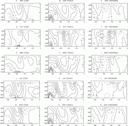
Table 2 The difference (LGM–PI) in DT500, annual mean temperature gradient over different latitude spans for CCSM3 and FGOALS.
Figure 3 The leading EOF from the 500hPa geopotential height field for the NCEP reanalysis data from 1979 to 2008. Solid lines indicate positive values and dashed lines indicate negative values.
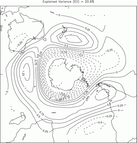
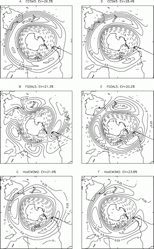
Figure 4 The leading EOF in the 500 hPa geopotential height field for each of the models used in this study. A–C, The PI control phase. D–F, The LGM phase. The figures are labelled to indicate which model each plot is taken from. Solid lines indicate positive values and dashed lines indicate negative values.