Figures & data
Figure 1. Share of cell-months with recorded BRDs that did not observe violence the month before or after. Source: UCDP GED 20.1.
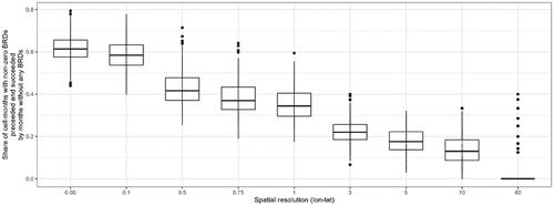
Table 1. Predictors. Sub-national level variables were calculated using the PRIO-GRID v.3(alpha) framework.
Figure 2. Performance evaluation based on model rank per metric. Colors in online version.
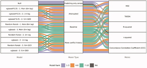
Figure 3. Performance metrics for predictions between 2014 and 2019. CCC () is bound between [–1,1], r-squared is bound between [0,1], R-squared is bound between [–∞,1], while MSE and TADDA are bound between [0, ∞]. Higher is better for CCC, r-squared and R-squared, while lower is better for MSE and TADDA. Colors in online version.
![Figure 3. Performance metrics for predictions between 2014 and 2019. CCC (ρc) is bound between [–1,1], r-squared is bound between [0,1], R-squared is bound between [–∞,1], while MSE and TADDA are bound between [0, ∞]. Higher is better for CCC, r-squared and R-squared, while lower is better for MSE and TADDA. Colors in online version.](/cms/asset/e41c8a8d-2a2a-40f0-945d-19c4dc6bd887/gini_a_2021198_f0003_c.jpg)
Figure 4. Zoom of the forecasts for Nigeria/Cameroon/Chad border (A + C) and Mozambique/Tanzania border (B + D). A + B shows the xgboost model's forecasts for October 2020 and the sum of battle-related deaths over the last year (since August 2020) in red. C + D shows the predictions (red, green, and blue line) plotted against the actual (black line) for the same cells as in A + B from January 2017 until December 2019. Colors in online version.
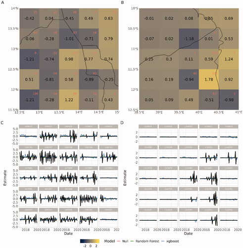
Figure 5. Accumulated local effects. Colors in online version.
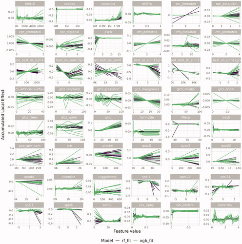
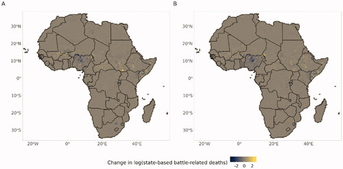
Figure 6. The maps show the forecasts from the xgboost model for (A) October 2020 and (B) March 2021.