Figures & data
Table 1. Overview of the contributions at country-month cm and PRIO-GRID-month pgm.
Figure 1. Example of pEMDiv (106 scale) computation for selected PRIO-GRID cells for October 2020, using predictions from D’Orazio and Lin (center) and the benchmark model (right) compared to the actuals (left).
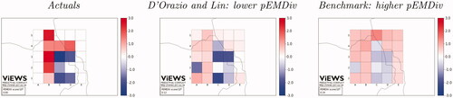
Figure 2. Parallel coordinates plots for the main metrics in the True future set (task 1), for s = 2. pEMDiv scores are reported in the scale 109.
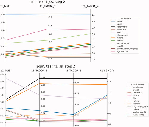
Figure 3. MSE for each step (month ahead) relative to the predictions for the true future (Task 1), at the cm (left) and pgm (right) level. The boxplots refer to the actual realizations of conflicts for each month in the October 2020–March 2021 period. The black dot represents the mean with all observations included, the dashed line is the mean with zero changes excluded, the red line is the median.
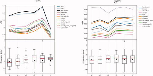
Table 2. Ensemble scores by step (months into the future), for True future set (task 1) and Test set (task 2), and for cm (top) and pgm (bottom).
Figure 4. Difference in MSE, True future set (task 1), between each model and model performing best in the test set (task 2), cm (top) and pgm, bottom. The bars represent 95% confidence intervals obtained by bootstrapping the vectors of predictions and actual values 1000 times and computing MSE for each bootstrapped pair. The best models, Mueller and Rauh (cm) and D’Orazio and Lin (pgm) are not shown.
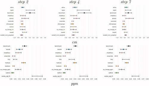
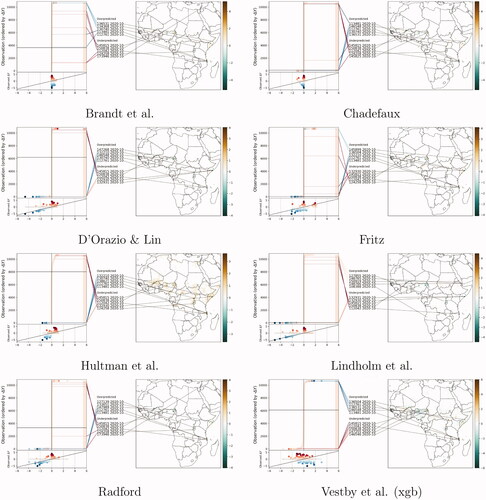
Figure 5. Plots of correlations between predictions from all contributed models, forecasts for October 2020, cm (left) and pgm (right).
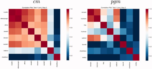
Figure 6. Summary of evaluation metrics by model (cm), True Future set (Task 1), predictions for October 2020 (s = 2). All metrics are normalized; MSE and TADDA scales are inverted so that the further away from the origin the better the model’s performance.
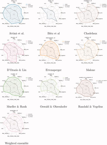
Figure 7. Summary of evaluation metrics by model (pgm), True Future set (Task 1), predictions for October 2020 (s = 2). All metrics are standardized; MSE and TADDA scales are inverted so that the further out from the origin, the better the model’s performance.
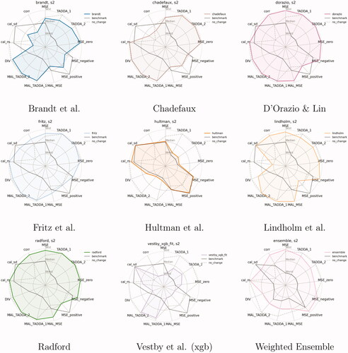
Figure 8. MAL—losses from removing individual models from the unweighted average ensemble. Dots are colored according to the MSE of the models on their own. Models that improve the predictive performance of the ensemble have positive scores and are plotted to the right of each panel.
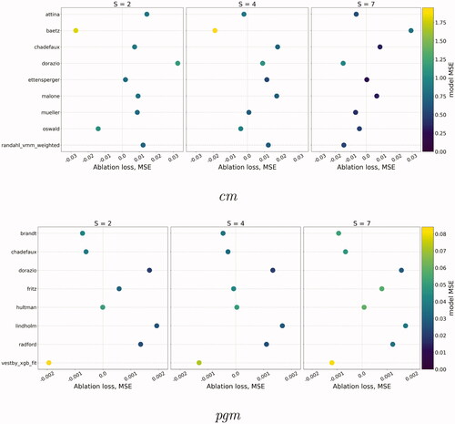
Figure 9. Scatterplots of conditional MSEs (x-axis) against the partial correlation between Y and (y-axis) for s = 2, True future set. Scores are defined with respect to the value of the outcome Y being equal, greater or lower than ϵ (0.048). Shapes correspond to different outcome values; dots stand for outcome values close to zero; upward triangles represent cases of escalation, and downward triangles those of de-escalation. To make dots visible, axes’ range differs for the near-zero subset (left column).
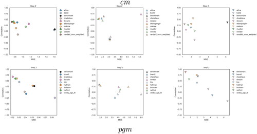
Figure 10. Error in predictions, Future set, cm, predictions for October 2020, s = 2.
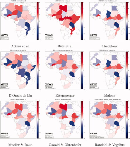
Figure 11. Model criticism plot, Future set, cm, Predictions for October 2020.
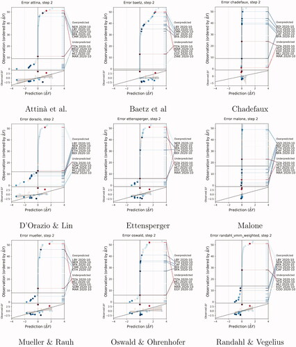
Figure 12. Model criticism plot, Future set, pgm, Predictions for October 2020.