
Figures & data
Figure 1. This graph depicts 100 estimates with 90% CI from a population with 50% of positive outcomes and a sample size of 80 students from a course of 160 students. The figure shows how many samples would not be properly identified as below the 60% threshold.
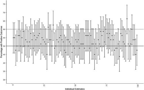
Figure 2. This graph depicts 100 estimates with 90% CI from a population with 65% of positive outcomes and a sample size of 108 students from a course of 360 students. Five samples would be identified as being below the 60% limit with an upper confidence interval below the 60% threshold.
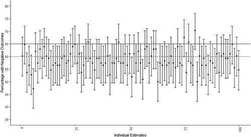
Table 1. Demonstrates the number and percentage of false positives by confidence intervals.
Table 2. Results of a logistic regression model predicting the likelihood of misclassification by 95% and 99% CIs compared to 90%.
Table 3. Illustrates how the percentages in graduate jobs impact the number of false positives for 90%, 95% and 99% CIs.
Figure 3. These graphs depict the percentage of false positive cases by confidence interval and sample size that is sampled from the population. Each graph represents the percentage with a positive outcome in the population starting from 40% top left to 55% bottom right. The horizontal lines represent levels of error expected for each confidence interval: the dotted line (•••) – 10% error for 90% CI; the dashed line (- - -) – 5% error for 95% CI.
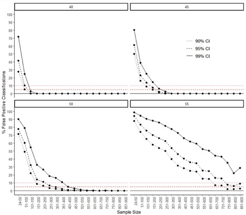
Figure 4. These graphs depict the percentage of false positive cases by confidence interval and percentage of the population that is sampled. Each graph represents the percentage with a positive outcome/graduate job in the population starting from 40% top left to 55% bottom right. The horizontal lines represent levels of error expected for each confidence interval: the dotted line (•••) – 10% error for 90% CI; the dashed line (- - -) – 5% error for 95% CI.
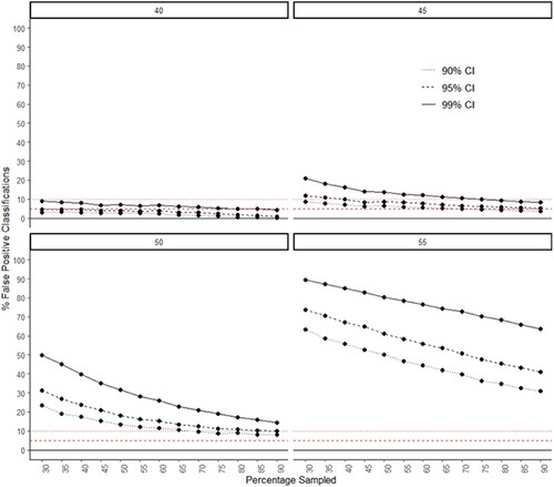
Table 4. Results of two logistic regression models on positive outcomes at 50% and 55% in the population with 90%, 95% and 99% CIs.
Table 5. Demonstrates the number and percentage of false negatives by confidence intervals on samples with 60% or above in positive outcomes.
Table 6. Illustrates how the number of false negatives fluctuates for 90%, 95% and 99% CIs depending on the percentages in graduate jobs.
Figure 5. These graphs illustrate the percentage of false negative cases by confidence interval and sample size that is sampled from the population. The two graphs represent the percentage with a positive outcome/graduate job in the population: 60% top and 65% bottom. The horizontal lines represent levels of error expected for each confidence interval: the dotted line (•••) – 10% error for 90% CI; the dashed line (- - -) – 5% error for 95% CI; the straight line (━) – 1% error for 99% CI.
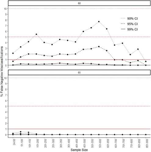
Figure 6. These graphs illustrate the percentage of false negative cases by confidence interval and the percentage of the population that is sampled. The two graphs represent the percentage with a positive outcome/graduate job in the population: 60% top and 65% bottom. The horizontal lines represent levels of error expected for each confidence interval: the dotted line (•••) – 10% error for 90% CI; the dashed line (- - -) – 5% error for 95% CI; the straight line (━) – 1% error for 99% CI.
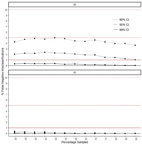
Table 7. Results of a logistic regression model predicting the likelihood of false negatives by 95% and 99% CIs as compared to 90%.
Data availability statement
The dataset and code to reproduce the results are available from the Open Science Framework at: https://osf.io/pd43c/?view_only = bb46a701d69846d99c0518616737df4f.