
Figures & data
Table 1. Type I error rate of testing versus
Figure 1. Contour plots for the density of a synthetic data set (n = 10, 000) for each simulation distribution.
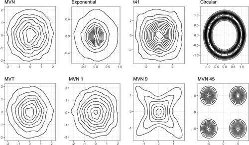
Figure 2. Type I error rate of testing versus
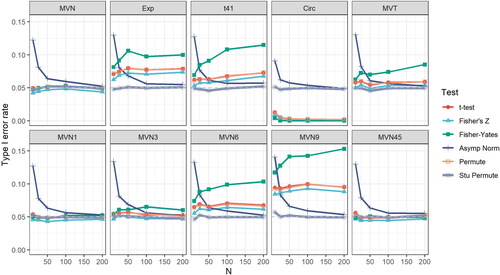
Table 2. Power of testing versus
under bivariate normal distributions.
Figure 3. Scatter plot of log-transformed TP53 versus FGFR1 abundance for TCGA data (a), and age versus for the PSA data (b).
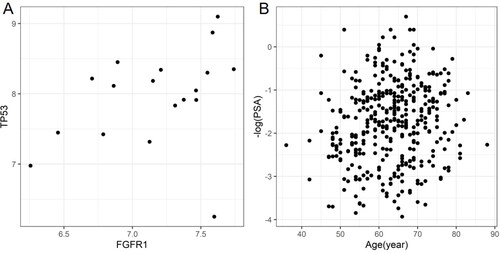
Table 3. Results of testing versus
for TCGA breast cancer data and PSA data.