Figures & data
Table 1. Dimensions, indicators, deprivation cut-offs and weights for the MPI.
Figure 1. Proportion (%) of population deprived in each indicator. Source: Authors’ calculations using the Census 2001, CS 2007, Census 2011 and CS 2016 data.
Note: the 2016 deprivation proportions of indicators [K] (overcrowding) and [L] (unemployment) are not available.
![Figure 1. Proportion (%) of population deprived in each indicator. Source: Authors’ calculations using the Census 2001, CS 2007, Census 2011 and CS 2016 data.Note: the 2016 deprivation proportions of indicators [K] (overcrowding) and [L] (unemployment) are not available.](/cms/asset/f5fb5bfb-0122-4781-ac16-367356771224/cdsa_a_1469971_f0001_oc.jpg)
Table 2. Multidimensional poverty by province, 2001–2016.
Table 3. The 10 district councils with the greatest absolute decline in MPI.
Figure 2. MPI decomposition (%) by province using weighting scheme (I), 2001–2011. Source: Authors’ calculations using the Census 2001, CS 2007 and Census 2011 data.
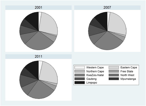
Figure 3. MPI decomposition (%) by province using weighting scheme (II), 2001–2016. Source: Authors’ calculations using the Census 2001, CS 2007, Census 2011 and CS 2016 data.
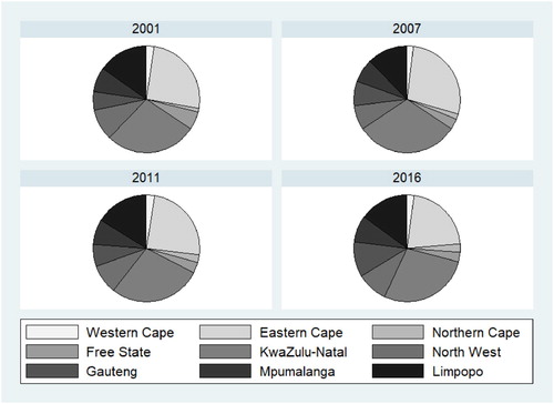
Table 4. MPI decomposition (%) by indicator, 2001–2011.
Table 5. MPI in each population quintile using weighting scheme (I), 2001–2011.
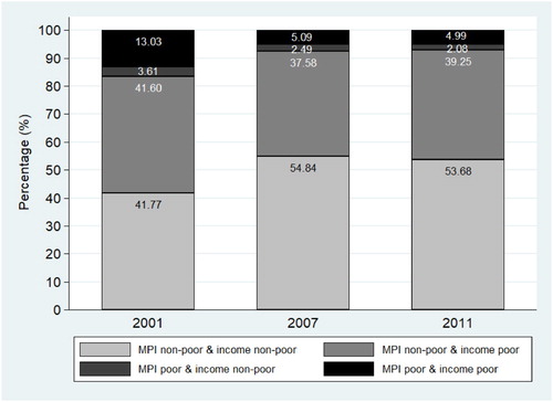
Figure 4. Proportion (%) of population in each poverty status category. Source: Authors’ calculations using the Census 2001, CS 2007 and Census 2011 data.