Figures & data
Fig. 1 Comparisons of the (top) non-data-assimilative solution and (bottom) data-assimilative solution with observations at Sept-Îles (latitude 50.1948°N, longitude 66.3768°W). The observations are sea surface elevations after removal of tides. The values in the panel titles are the ratios of the misfit variance to the observed variance; the smaller this value the better the agreement between simulations and observations.
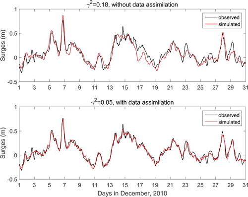
Fig. 2 Long-term simulations of storm surges (top) without data assimilation, (middle) with equally weighted data assimilation, and (bottom) with surge-weighted data assimilation. The simulations are shown in red and the observations are shown in black with data gaps. The data outside the yellow band are larger than 35 cm in absolute value and are referred to as surge data. The simulations are continuous but are not shown when there are data gaps.
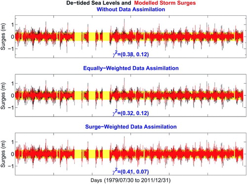
Fig. 3 (top) Half data assimilation and half prediction: the assimilative solution is shown in red, the prediction is shown in green, and the observations are in black. The misfit measurements (for surges only) for the assimilation and for the prediction are shown by the values in red and in green, respectively. (middle) and (bottom) Two enlarged views of the top panel.
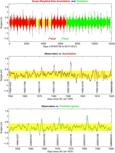
Fig. 4 Snapshot of the mean sea level air pressures at 2100 utc 30 November 2100 using the CTRCM/AHJ solution.
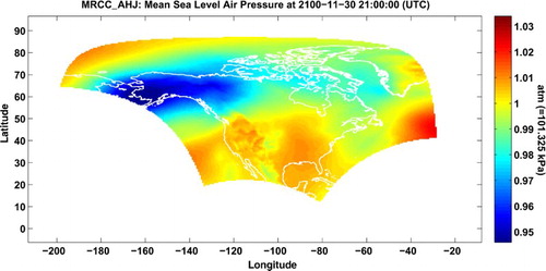
Fig. 5 Time series of storm surges at Sept-Îles, (top) observations, (middle) driven by the MERRA forcing field, and (bottom) driven by the CRMC/AHJ forcing field. Data points outside the red band have an absolute value larger than 35 cm. From the top to the bottom panels, the means of the time series are 0.00, 0.00, and 0.00 cm, respectively and the standard deviations are 15.91, 17.06 19.71 cm, respectively.
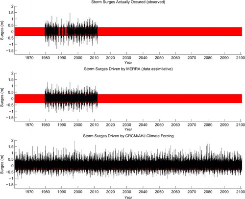
Fig. 6 (left) EVA results from the simulated annual maxima (blue) and from the observed annual maxima (black). The symbols are the experimental data; the straight lines are the least-squares fit lines, and the shaded intervals are the 67% confidence intervals. The results in blue are systematically biased from those in black. (right) The data and line in blue are corrected for biases.
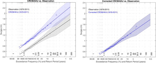
Fig. 7 The simulated annual maxima from 1961 to 2100, the best fit Gumbel's straight line, and the associated 67% confidence interval are show in blue; the counterparts from the observed 1979–2011 annual maxima are in black.
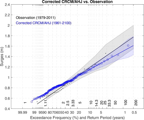
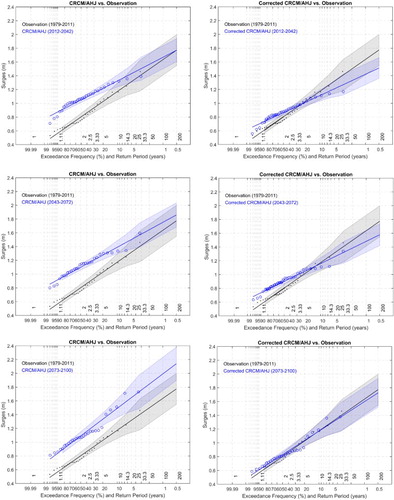
Fig. 8 Results of the EVA applied to tri-decadal segments of the storm surges driven by CRCM/AHJ. (left) Results without bias corrections; (right) results with bias corrections.