Figures & data
Fig. 1 Map showing the key regions (bold font), AZMP sampling areas (italic font and hatched regions), and major topographic features over the eastern Canadian continental shelf. The inset shows an enlargement along the Halifax Line. The location of the ADCP stations (triangles) and the orientation chosen for the alongshore and cross-shore components (rotation by 58° from true north) are also included. The idealized glider track follows the traditional Halifax Line.
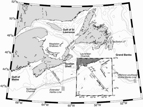
Fig. 2 (a) Illustration of the colour scheme used in the T-S space obtained by projecting Maxwell’s triangle onto the mixing triangle defined by the water masses described in Section 2.a.1, with a vertex defined as the average of the InLC and CBS-CIL and the other two defined by the WSW and the CBSS. Labrador Slope Water (LSW) T-S characteristics are also indicated. Endmembers are determined for the 2011–2014 period and are represented as ellipses centred on the average temperature and salinity of the observations in the corresponding region. The vertical and horizontal axes represent the standard deviations of the temperature and salinity fields, respectively; (b) example of the T-S distribution in spring to illustrate the different mixing lines and axes of variability. Inset in (b) is an enlargement of the tip of the T-S distribution to better visualize the deep mixing line. Density contours are also indicated in both plots.
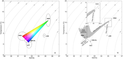
Table 1. Annually averaged temperature (˚C) and salinity used to describe the subsurface water from Cabot Strait (CBSS), the Cold Intermediate Layer formed in the GSL (CBS-CIL), Inshore Labrador Current (InLC) water, Warm Slope Water (WSW), and Labrador Slope Water (LSW). The averaged values over the 4-year 2011–2014 period used to study the variability at seasonal time scales are also included. The number inside parentheses represents one standard deviation.
Fig. 3 (a) Temporal coverage of the datasets collected by the ADCPs and underwater gliders. (b) Spatial coverage of each glider mission along the Halifax Line. Readers may refer to for the geographical locations of the T-stations.
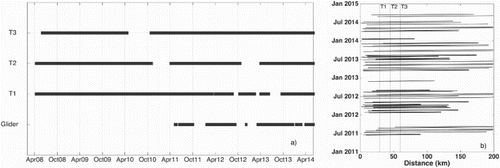
Fig. 4 Gridded fields of glider-based temperature (°C; left column), salinity (middle column), and potential density (kg m–3; right column) in winter (first row), spring (second row), summer (third row); and fall (fourth row) at the Halifax Line, averaged over the period from June 2011 to September 2014. The 4°C isotherm is used to define the Cold Intermediate Layer (CIL) and is represented as a thick line in the temperature transects. Blue denotes either cold (left), fresh (middle), or low-density (right) water, while red represents either warm (left), more saline (middle), or denser (right) water.
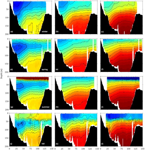
Fig. 5 Left panels present T-S diagrams based on glider observations at the Halifax Line for the 2011–2014 period winter (first row), spring (second row), summer (third row), and fall (fourth row). The colour scheme corresponds to Maxwell’s triangle (see ). Endmembers are calculated for the 2011–2014 period and are represented as an ellipse centred on the centre of gravity of the observations in the corresponding region with the main axes representing the standard deviation of the temperature and salinity fields. Right panels show the distributions of corresponding transects using the same colour scheme in the four seasons. In all panels, the grey colour is associated with the observations collected within the top 30 m of the water column.
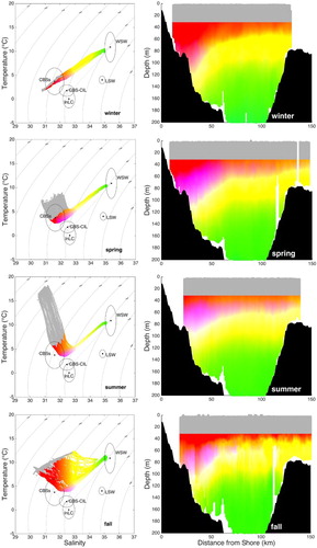
Fig. 6 Gridded fields of alongshore geostrophic currents (negative means southwestward) calculated from glider measurements of temperature, salinity, and depth-averaged currents in (a) winter, (b) spring, (c) summer, and (d) fall over the 2011–2014 period. The location of the T-stations are marked (dashed lines), and the extent of each section described in Section 5 is shown.
Fig. 7 Time series of the seasonally averaged proportion (%) over the entire HL of the Cabot Strait subsurface water (CBSS, squares), Warm Slope Water (WSW, circles), and the average between Inshore Labrador Current water (InLC) and Cabot Strait Cold Intermediate Layer water (CBS-CIL, triangles) between 30 and 50 m (upper panel), 50 and 100 m (middle panel), and between 100 and 200 m (lower panel). The percentages are calculated using the method and equations described in Section 2.a.3.
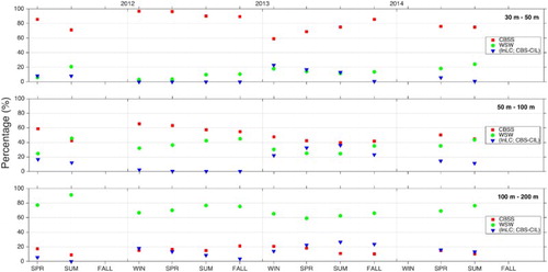
Fig. 8 (a) Daily-averaged alongshore transport and (b) average seasonal cycle in Sv (negative means southwestward) between T1 and T3 computed using ADCP measurements over the 2008–2014 period. A 50-day moving average was used to smooth the high-frequency variability of the time series. (c) Low and (d) high-frequency transport anomaly (Sv) calculated by subtracting the smoothed and raw curves in (b) from the ones in (a).
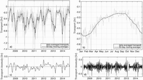
Fig. 9 Left panel presents the normalized cross-covariance function between the monthly mean estimate of the St. Lawrence River runoff at Québec (Bourgault & Koutitonsky, Citation1999; Galbraith et al., Citation2014) and the negative transport computed from the ADCP records at three stations. The 95% confidence intervals (dashed lines) calculated using
, where N is the number of observations, are superimposed. The two time series are shown in the right panel for the 2008–2014 period.
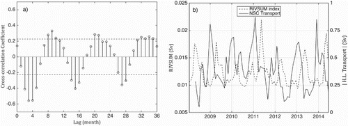
Fig. 10 Time series of geostrophic transport (negative means southwestward) over four different sections of the Halifax Line ((a) through (d)) computed from glider transects (filled squares). The daily averaged transport estimated from ADCP measurements between T1 and T3 is shown (dashed line) in (a) and the extent of each section is shown in (e)
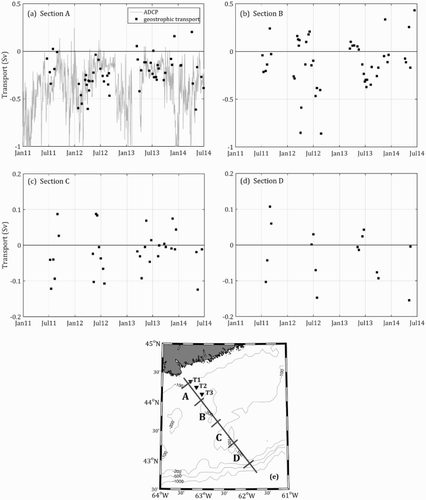
Fig. 11 Mode coefficients and patterns of the first (top three rows) and second (bottom three rows) EOFs calculated from the daily-averaged annual time series of observed alongshore currents at T1, T2, and T3 over the 2008–2014 period (negative means southwestward). For each mode, the vertical profile of the EOF, the mode coefficient, and the corresponding reconstructed flow are shown. The annual mean flow was included in the flow reconstruction based on the EOF. The percentage of variability explained by each mode is also indicated.
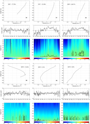
Fig. A1 Schematic showing the algorithm used to estimate depth-averaged currents from the glider drift. Ta refers to the time when the glider dives; Tb and Tb′ correspond to the surfacing times; Tc is the time stamp for the first GPS fix; Td refers to the time stamp of the second GPS fix; and T_middle is the middle point of the glider’s dive. The solid line represents the path of the glider as extrapolated by dead reckoning. The red arrow represents the depth-averaged current experienced by the glider between the last two surfacings; the blue arrow represents the depth-averaged current calculated by the glider and the green arrow represents the surface drift.
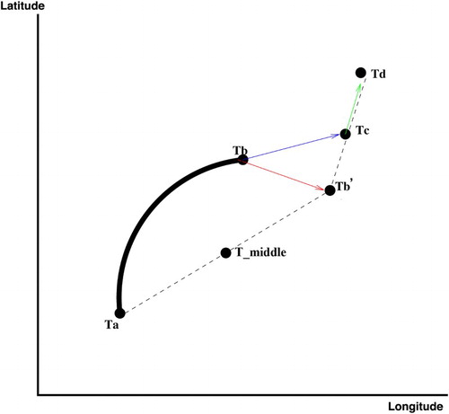
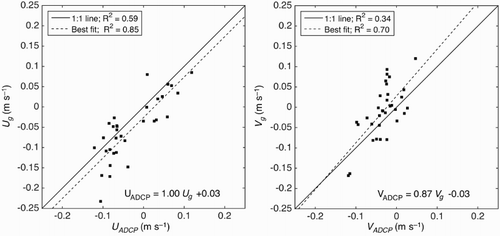
Fig. A2 Comparison between the depth-averaged, cross-shore (U, left) and alongshore (V, right) currents measured by one of the ADCPs located at the T-station and the depth-averaged current experienced by the glider during a dive within a 2 km radius from an ADCP station. The goodness of fit R2 between glider-based and ADCP observations is indicated for the non-calibrated datasets (1:1 line, solid line), as well as for the calibrated glider-based current using the linear equation indicated in the figures (best fit, dashed line).