Figures & data
Fig. 1 The Canadian Arctic Prediction System domain and topography field (grey line and colour-scale). Superimposed are the stations used for evaluating the verification statistics, over the Fennoscandia (497 stations) and the North America North domain (140 stations). The contour of the Regional Deterministic Prediction System is also superimposed (grey line).
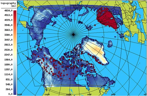
Fig. 2 Bias (dotted lines) and error standard deviation (solid lines) for near-surface air temperature (panels a and b) and dew-point temperature (panels c and d) for the 00Z runs of CAPS (red), RDPS (blue), GDPS (green) models, for the summer SOP, over North America North (left panels) and Fennoscandia (right panels). In the bottom sub-panels, the blue and green lines are the RDPS-CAPS and GDPS-CAPS score difference for the error standard deviation, with its associated bootstrap 90% confidence interval (blue and green shading): positive values indicate a statistically significant better score for CAPS.
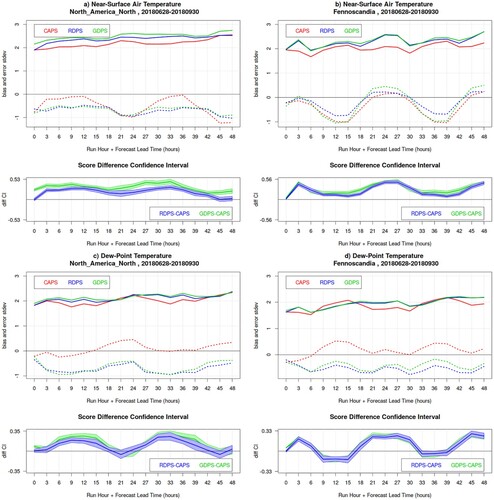
Fig. 3 Wind verification results for the 00Z runs of CAPS (red), RDPS (blue), GDPS (green) models, for the summer SOP, over North America North (left panels) and Fennoscandia (right panels). Panels a and b show the bias (dotted lines) and error standard deviation (solid lines) for wind speed; grey curves (dark for CAPS, medium for RDPS, light for GDPS) show the same statistics obtained solely for forecast and observed winds exceeding 3 m/s (bilateral condition). In the lower sub-panels, the blue and green lines are the RDPS-CAPS and GDPS-CAPS error standard deviation difference, with its associated bootstrap 90% confidence interval (blue and green shading): positive values indicate a statistically significant better score for CAPS. Panels c and d show the wind vector RMSE and the wind direction MAE (with scale values on the right vertical axis), when both forecast and observed wind speeds are larger than 3 m/s (solid and dotted lines, respectively), and when observed wind speeds (only) are larger than 3 m/s (dot-dashed and dashed lines, respectively). In the lower sub-panels, the blue and green lines are the RDPS-CAPS and GDPS-CAPS vector RMSE score difference for the statistics obtained with the bilateral condition, with its associated bootstrap 90% confidence interval (blue and green shading): positive values indicate a statistically significant better score for CAPS.
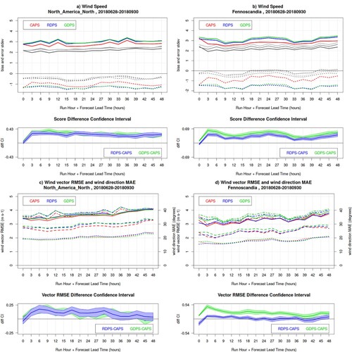
Fig. 4 Bias (dotted lines) and error standard deviation (solid lines) for near-surface air temperature (panels a and b) and dew-point temperature (panels c and d) for the 00Z runs of CAPS (red), RDPS (blue), GDPS (green) models, for the winter SOP, over North America North (left panels) and Fennoscandia (right panels). For Fennoscandia, the error standard deviation for February-March 2019 (dot-dashed lines) and 2020 (dashed lines) is also illustrated. In the bottom sub-panels, the blue and green lines are the RDPS-CAPS and GDPS-CAPS score difference for the error standard deviation, with its associated bootstrap 90% confidence interval (blue and green shading): positive values indicate a statistically significant better score for CAPS.
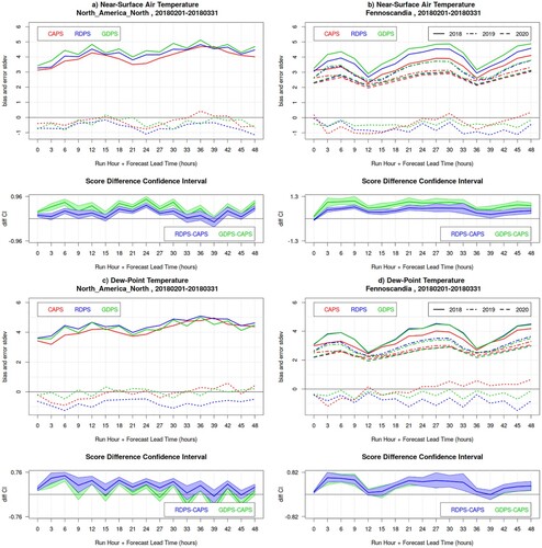
Fig. 5 As , but for the winter SOP.
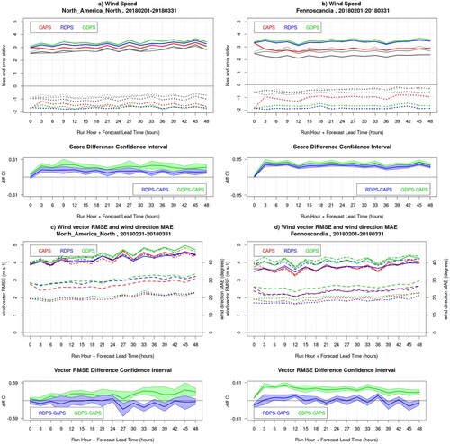
Table 1. Measurement sample sizes associated with the temperature and wind summary statistics shown in . The wind direction reduced sample includes solely cases when both observed and forecast winds are stronger than 3 m/s.
Fig. 6 Frequency Bias Index (FBI) and Heidke Skill Score (HSS) of the CAPS (red) RDPS (blue) and GDPS (green) models, evaluated against precipitation measurements of the CaPA station network, for 6 h precipitation accumulation exceeding 0.2 mm (left column panels), 1.0 mm (central column panels) and 2.0 mm (right column panels), for Fennoscandia and North America North, during the summer SOP.
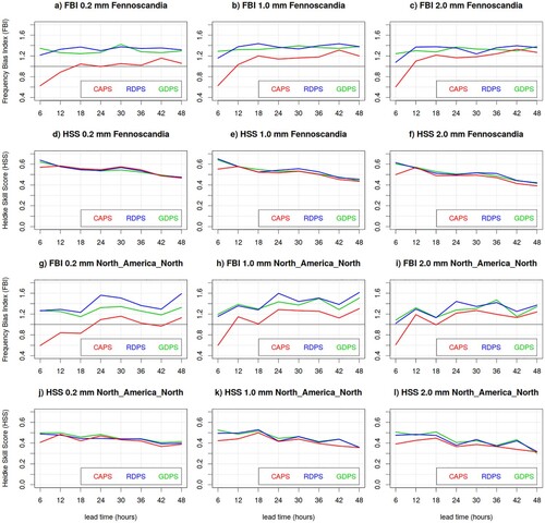
Fig. 7 Frequency Bias Index (FBI) and Heidke Skill Score (HSS) of the CAPS (red) RDPS (blue) and GDPS (green) models, evaluated against precipitation measurements of the CaPA station network, for 6 h precipitation accumulation exceeding 0.2 mm (left column panels), 1.0 mm (central column panels) and 2.0 mm (right column panels), for Fennoscandia and North America North, during the winter SOP.
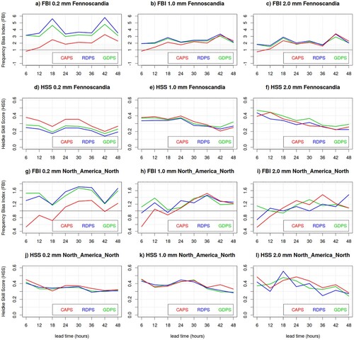
Fig. 8 Frequency Bias Index (top row panels a, e and i), Threat Score (second row panels b, f and j), verification sample size (third row panels c, g and k) and base rate (number of observed events exceeding the 1 mm threshold, bottom row panels d, h and l) evaluated against precipitation measurements of the CaPA station network, for 6 h precipitation accumulation exceeding 1.0 mm, for the CAPS (left panels), RDPS (central panels) and GDPS (right panels) in Fennoscandia during the winter SOP. In each graph, red curves and bars are obtained from quality controlled data (with QC), whereas blue curves and bars are obtained from non-quality controlled data (without QC); the lower sub-panels of a, b, e, f, i and j show the score difference (black line) with its associated bootstrap 90% confidence interval (grey shading).
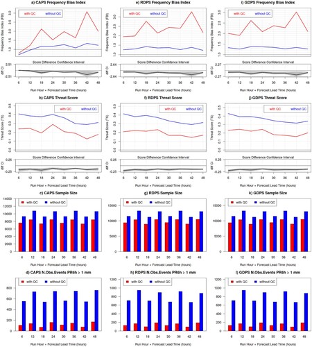
Fig. 9 Solid precipitation undercatch adjustment function proposed by Kochendorfer et al. (Citation2017), where the Catch Efficiency (y-axis) is plotted as function of wind speed (x-axis). The top panel shows the Universal adjustment for different gauge shields and heights of wind measurements, whereas the bottom panel compares the adjustments for different locations and temperatures, for installations with Single Alter shielding and wind measurements at 10 m. The circles in the top panel and vertical lines in the bottom panel correspond to the wind speed thresholds beyond which the adjustment is kept constant.
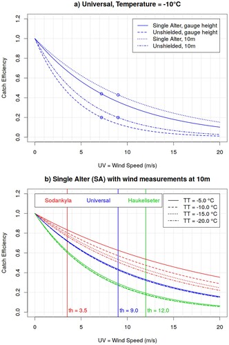
Table 2. Estimates of the parameters a, b and c and threshold th associated with the catch efficiency for installations with Single Alter (SA) versus unshielded (Un) gauges, with 10 m versus gauge-height (gh) wind measurements, used to obtain the Universal, Sodankyla and Haukeliseter adjustment function.
Fig. 10 Frequency Bias Index for the CAPS (top panels) RDPS (central panels) and GDPS (bottom panels) model, evaluated against precipitation measurements of the synoptic station network, for 6 h precipitation accumulation exceeding 1.0 mm, over North America North (left column panels) and Fennoscandia (right column panels), during the winter SOP. The black curve is obtained against unadjusted measurements, whereas colour curves are obtained against adjusted solid precipitation measurements for Single Alter (SA) versus unshielded (Un) gauges, with 10 m versus gauge-height (gh) wind measurements, and applying the universal (blue lines), Sodankyla (red lines) or Haukeliseter (green lines) adjustment function.
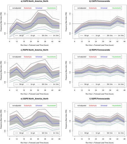
Fig. 11 Threat Score for the CAPS (top panels) RDPS (central panels) and GDPS (bottom panels) model, evaluated against precipitation measurements of the synoptic station network, for 6 h precipitation accumulation exceeding 1.0 mm, over North America North (left column panels) and Fennoscandia (right column panels), during the winter SOP. The black curve is obtained against unadjusted measurements, whereas colour curves are obtained against adjusted solid precipitation measurements for Single Alter (SA) versus unshielded (Un) gauges, with 10 m versus gauge-height (gh) wind measurements, and applying the universal (blue lines), Sodankyla (red lines) or Haukeliseter (green lines) adjustment function.
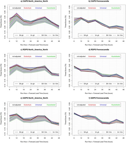
Fig. 12 (left) GDPS and (right) CAPS topography (grey shading, metres) over Fennoscandia, and altitude difference between the model topography and station elevations (colour dots, metres).
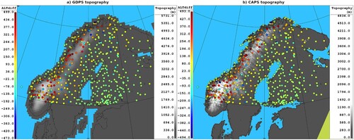
Fig. 13 GDPS surface temperature bias, for the summer SOP over Fennoscandia, at 24 and 36 UTC (night-time and day-time respectively), before and after the model tile temperature adjustment to station elevation.
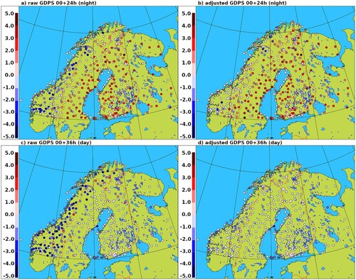
Fig. 14 GDPS surface temperature RMSE (panel a), bias and error standard deviation (panel b, dotted and solid lines, respectively) as function of lead-time (x-axis), for the summer SOP over Fennoscandia, before (red and green curves) and after (blue and grey curves) the temperature lapse-rate adjustment. Statistics evaluated over the subset “altdiffmax500” of stations which differ at the most 500 m in altitude from the corresponding (nearest) model tile elevation are labelled “500” (blue and green curves). The bottom panel shows the difference between error standard deviations (grey) and RMSE (magenta) for the GDPS raw model output (red curves) versus the GDPS adjusted temperatures for tiles within 500 m from the station altitude (blue curves), with their associated bootstrap 90% confidence interval (grey and pink shading): negative values indicates a statistically significant better score for lapse-rate adjusted temperatures evaluated over the “altdiffmax500” subset of stations.
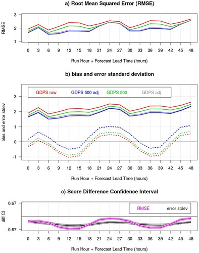
Fig. 15 GDPS surface temperature bias (lower curves) and error standard deviation (upper curves) as function of lead-time (x-axis), for the summer SOP over Fennoscandia. Solid lines show verification statistics evaluated over all stations with wind and cloud measurements; dotted lines show verification statistics evaluated excluding events with inversion conditions. Green and blue curves are evaluated over the subset “altdiffmax500” of stations which differ at the most 500 m in altitude from the corresponding (nearest) model tile elevation. Red and green curves are obtained against raw model output, whereas blue and grey curves are obtained by applying a temperature lapse-rate adjustment. Dashed blue curves are obtained applying a temperature adjustment with inversion lapse-rate of −0.0032°C/m when night-time inversion conditions occurred.
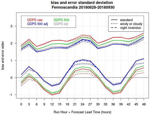
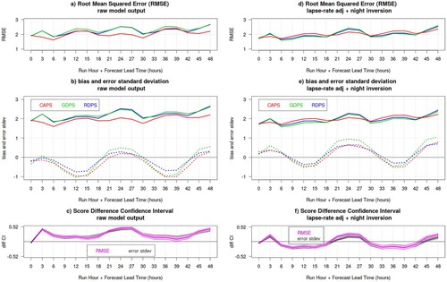
Fig. 16 Surface temperature RMSE (panels a and d), bias and error standard deviation (dotted and solid lines, respectively, in panels b and e), for the CAPS (red), GDPS (green) and RDPS (blue) as function of lead-time (x-axis), during the summer SOP over Fennoscandia. Verification statistics are evaluated over all stations with wind and cloud measurements: the left panels show results for raw model output, whereas the right panel shows results obtained after applying the temperature lapse-rate adjustment (with night inversions). The bottom panels shows the difference between the CAPS and GDPS error standard deviations (grey) and RMSE (magenta), with their associated bootstrap 90% confidence interval (grey and pink shading): positive values indicates a statistically significant better score for CAPS.