
Figures & data
Fig. 1 Left: The two largest eigenvalues (y-axis) of the long-run covariance matrix estimated from the volatility panel analyzed in Section 5.3 (March 2008 to March 2009, n = 252) with subsets of cross-sections randomly sampled 100 times for each given dimension (x-axis). Right: logged and truncated p-values (truncation level chosen by Bonferroni correction with the significance level 0.1) from fitting a VAR(5) model to the same dataset using ridge regression and generating p-values corresponding to each coefficient as described in Cule, Vineis, and De Iorio (Citation2011). For each pair of variables (corresponding tickers given in x- and y-axes), the minimum p-value over the five lags is reported.
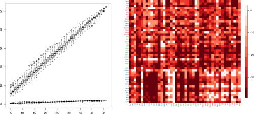
Fig. 2 Heat maps of the estimators of the VAR transition matrices , partial correlations from
and long-run partial correlations from
(left to right), which in turn estimate the networks
, and
, respectively, over three selected periods. The grouping of the companies according to their industry classifications are indicated by the axis label colors. The heat maps in the left column are in the scale of
while the others are in the scale of
, with red hues denoting large positive values and blue hues large negative values.
![Fig. 2 Heat maps of the estimators of the VAR transition matrices Â1, partial correlations from Δ̂ and long-run partial correlations from Ω̂ (left to right), which in turn estimate the networks NG,NC, and NL, respectively, over three selected periods. The grouping of the companies according to their industry classifications are indicated by the axis label colors. The heat maps in the left column are in the scale of [−0.81,0.81] while the others are in the scale of [−1,1], with red hues denoting large positive values and blue hues large negative values.](/cms/asset/f1803709-a7e2-406f-9cab-2076e7c64a29/ubes_a_2257270_f0002_c.jpg)
Table 1 Mean, median and standard errors of and
on the trading days in 2012 for
in comparison with AR and FarmPredict (Fan, Masini, and Medeiros Citation2021) forecasts.