Figures & data
Table 1 Score-based tests for time variation.
Fig. 1 Prediction error and parameters’ updating.
NOTE: The figures plot the weighting scheme implied by wt
, and the scaled scores, for different values of the standardized prediction error . We consider the Gaussian case (black), the symmetric t5 (red), and positively (blue) and negatively (green) Skt5.
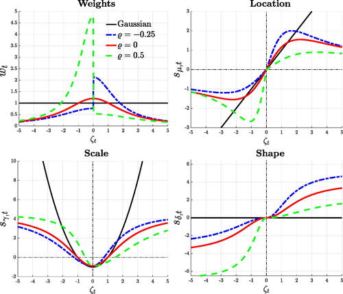
Fig. 2 Time-varying mean and variance.
NOTE: The plots illustrate the time-varying mean and standard deviation (blue), along with the respective long-run components, in red, and 90% credible intervals. Shaded bands represent NBER recessions.
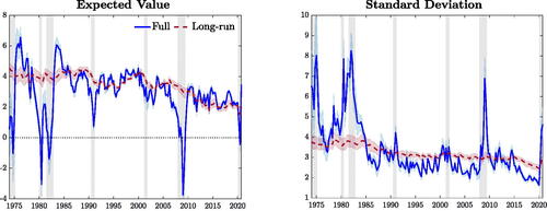
Fig. 3 Time-varying asymmetry.
NOTE: The left panel illustrates the estimated time-varying moment skewness (blue), along with its long-run component (red). The right panel reports the upside and downside volatilities, in blue and red, respectively. Shadings correspond to 90% credible intervals. Shaded bands represent NBER recessions.
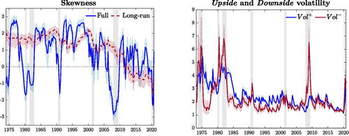
Fig. 4 Expected value and variance decomposition.
NOTE: The plot shows the decomposition of the expected value and variance of GDP growth. Location and scale are reported in red, while the contribution of higher order moments is in blue. Central moments (black) are computed as in (10) and (11). Shaded bands represent NBER recessions.
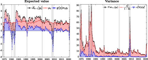
Fig. 5 Long-run GDP growth and volatility.
NOTE: The left plot shows the contribution of the long-run location (red), and of higher order moments (blue) to the long-run expected value (black). Similarly, we decompose the total long-run variance (black) into upside (blue) and downside (red) variance. Shaded bands represent NBER recessions.
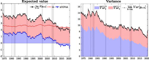
Fig. 6 Unconditional skewness.
NOTE: The figure reports the distribution of the unconditional skewness, obtained from 10,000 paths of GDP growth simulated from the model. The vertical lines indicate the unconditional skewness estimated over two alternative samples.
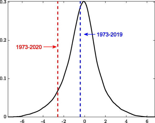
Fig. 7 Predictive financial conditions.
NOTE: The figures plot the decomposition of and
(black) into a “Score-driven” (yellow) and “Predictor-driven” components. Shaded bands represent NBER recessions.
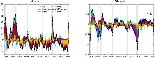
Table 2 Forecasting performance.
Table 3 Forecast performance with respect to Adrian, Boyarchenko, and Giannone (Citation2019).
Table 4 Density calibration tests.
Fig. 8 Expected shortfall and expected longrise.
NOTE: We report the and
. Probabilities of recessions are computed as the probability of observing two consecutive negative growth forecasts over the next four quarters. Shaded bands represent NBER recessions.
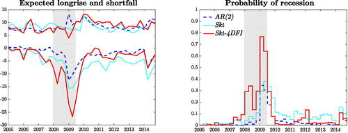
Table 5 Tail risk scores.
Table 6 Sparse forecast performance.
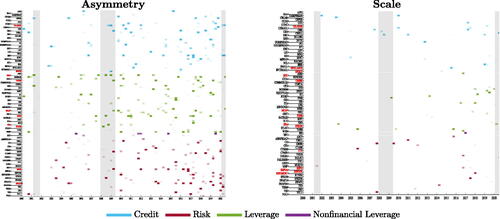
Fig. 9 Sparsity.
NOTE: The panels reports the evolution of the financial predictors selected for the asymmetry and scale parameters. Names in red indicate the 10 predictors with the highest posterior probability of inclusion (pip); names in bold indicates predictors with the highest pip around the Global Financial Crisis.