
Figures & data
Figure 1. Proportion of minority group students in residential neighborhoods (SAMS). The points represent approximate location of schools. The darker colors indicate neighborhoods with a higher proportion of minority (immigrant origin) students in 2017.
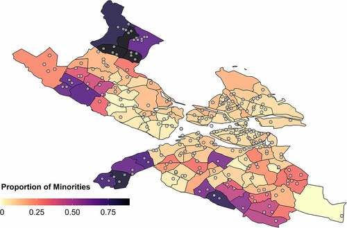
Figure 2. Simulation flowchart.
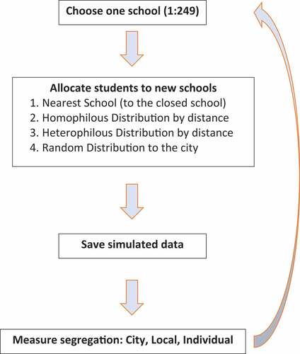
Figure 3. Density of schools based on the change in segregation generated by their closure. (a) City-level segregation, measured using the two-group information theory index, H. In Stockholm, the observed level of segregation in 2017 was 0.295. (b) Local-level segregation, measured using the two-group information theory index, H. The local area is defined as the 2 km radius around the closed school. The average local-level segregation in the observed data is 0.162(±0.088, min: 0.006, max: 0.483). (c) Change in the out-group exposure of the minority student population to majority group students, measured only for students from the closed schools. For each closed school, and each simulation, the new level of exposure is the average of the minority students’ school-level exposure at their destination schools.
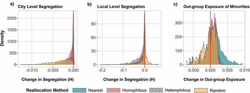
Figure 4. Adjusted predictions for the change in segregation produced by each reallocation method, by closed school characteristics. (a) Percentage change in city-level segregation, measured by the information theory segregation index, H. (b) Percentage change in local-level segregation, measured by the information theory segregation index, H. (c) Marginal change in the out-group exposure of minority group students (destination schools—closed school).
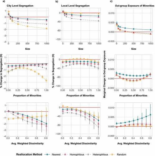
Figure 5. Adjusted predictions for the interaction between ethnic composition and opportunity structure: Adjusted predictions for the marginal effects of the interaction terms between the proportion of minority students (x-axis) at closed schools, and the average weighted dissimilarity between the closed schools and neighboring schools within 2 km (Avg. Weigh. Dissimilarity in in the Appendix). Presented by different levels of compositional dissimilarity (rows) with the values: 0, 0.5, 0.8.
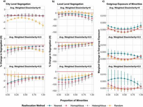
Figure A1. Change in out-group exposure (interaction), and in-group exposure (isolation), of minority students at the city level. The exposure index is calculated at the city level. The interaction index for 2017 with no school closures is represented by the vertical red line, which corresponds to an index score of 0.483, whereas the corresponding score for the isolation index is 0.517.
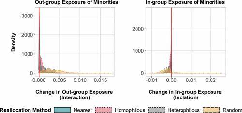
Figure A2. Change in segregation, by school size (y-axis) and the proportion of minority students (x-axis) at the closed schools. Results are based on a simulation run chosen at random to showcase the data produced by the simulations.
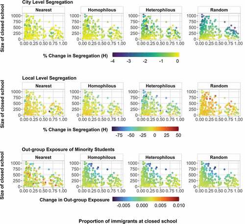
Figure A3. Change in segregation at the city, local, and individual levels. Reallocation mechanisms use neighborhoods defined as areas that are within 5 km of each school. Since this change only affects the two reallocation mechanisms that rely on the specified local neighborhood size, only these are presented. Given that the variation in results between simulation runs is negligible, the figure only presents the results from one simulation run.

Table A1. Regression estimates. Change in ethnic segregation following the closure of each of the 249 schools in Stockholm in 2017. Simulated data based on 65 simulation runs for each allocation method.
Table A2. Regression estimates. Change in ethnic segregation following the closure of each of the 241 schools (79,066 students) in Stockholm in 2016. Simulated data based on 50 simulation runs for each allocation method.