
Figures & data
Table 1. Demographic information for final sample of participants split by age.
Figure 1. Distributions of (a) work day sleep duration, (b) free day sleep duration, (c) midpoint of sleep, and (d) social jetlag before (red) and during (blue) lockdown. Vertical dashed lines represent the means.
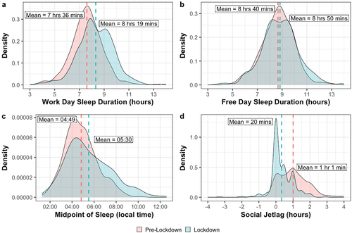
Table 2. Comparisons between pre-lockdown and lockdown for each sleep habit parameter. Means for sleep duration and social jetlag variables represent number of hours and minutes. Means of all other variables represent clock time (hh:mm). Standard deviations for all variables represent number of minutes. Z statistics, bonferroni-corrected p values, effect sizes (r), and number of observations for each wilcoxon matched-pairs test are also reported.
Figure 2. Distributions of (a) work duration, (b) the midpoint of the working day, and (c) work engagement before (red) and during (blue) lockdown. Higher UWES-9 scores indicate greater work engagement. Vertical dashed lines represent the means.
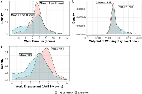
Table 3. Comparisons between pre-lockdown and lockdown for each work habit parameter. Means and standard deviations for the work duration variable represent number of hours and minutes. Means and standard deviations for the work engagement variable represents score on the UWES-9 scale where higher scores indicate better work engagement. Means of all other variables represent clock time (hh:mm) and standard deviations for all other variables represent number of minutes. Z statistics, bonferroni-corrected p values, effect sizes (r), and number of observations for each wilcoxon matched-pairs test are also reported.
Figure 3. Scatterplots displaying circadian preference against (a) midpoint of sleep change, (b) social jetlag change, and (c) working day midpoint change. Positive values on the y axis indicate delayed lockdown sleep midpoint (3a) and working day midpoint (3c) compared to pre-lockdown, or increased social jetlag during lockdown compared to pre-lockdown. Densigram on the x axes (above the figures) displays the distribution of circadian preference (MEQr score). Densigram on the y axes (right of figures) displays the distribution of ∆ midpoint of sleep (3a), ∆ social jetlag (3b), and ∆ working day midpoint (3c).
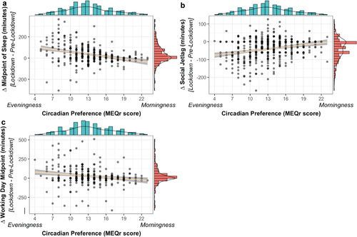
Table 4. Model summary statistics for the three linear regression models with circadian preference as the only predictor variable and ∆ midpoint of sleep, ∆ social jetlag, or ∆ working day midpoint as the dependent variables (DVs).
Table 5. Model summary statistics for significant predictors in the final models of the three linear regression analyses with ∆ work engagement as the dependent variable, and demographic variables and either ∆ midpoint of sleep, ∆ social jetlag, or ∆ working day midpoint as the predictor variables (IVs). See supplementary table 2 for full model summary statistics of final models.
Figure 4. Scatterplot displaying social jetlag change against work engagement change. Positive values on the x axis indicate that social jetlag was greater during lockdown compared to pre-lockdown. Positive value on the y axis indicate that work engagement was greater during lockdown compared to pre-lockdown. Densigram on the x axis (above the figure) displays the distribution of ∆ social jetlag. Densigram on the y axis (right of figure) displays the distribution of ∆ work engagement.
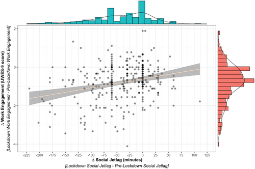
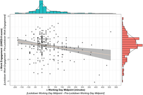
Figure 5. Scatterplot displaying working day midpoint change against work engagement. Positive values on the x axis indicate that the midpoint of the working day during lockdown was delayed (later) compared to pre-lockdown. Positive values on the y axis indicate that work engagement was greater during lockdown compared to pre-lockdown. Densigram on the x axis (above the figure) displays the distribution of ∆ working day midpoint. Densigram on the y axis (right of figure) displays the distribution of ∆ work engagement.
Supplemental Material
Download PDF (1.4 MB)Data availability statement
The data and analysis scripts underlying this article are available on the Open Science Framework at https://osf.io/jnfrv/.