
Figures & data
Figure 1. Experimental workflow of embryo invasion model in vitro. (A) Diagram of the experimental design. (B) Cellular morphology of embryos in the experimental group at 48 h after coculture with phESCs. The box indicates the embryos. Black horizontal scale bar: 100 μm.
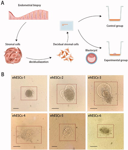
Figure 2. Overall transcriptomic changes between phESCs and ehESCs. (A) Principal component analysis of clusters by cell population. (B) Cluster analysis of differentially expressed genes between the phESCs and ehESCs is displayed in a heatmap. Heatmap colours represent the relative mRNA expression levels, as indicated in the colour key.
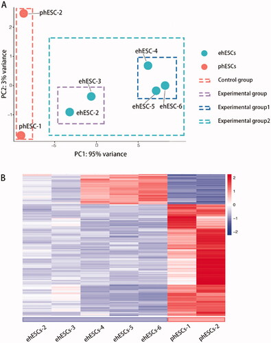
Figure 3. General analysis of differentially expressed genes (DEGs). (A) Volcano plot showing the distribution of up-regulated genes (dots in the right box) or down-regulated genes (dots in the left box) in phESCs and ehESCs. (B) A list of the top 15 down- and up-regulated genes.
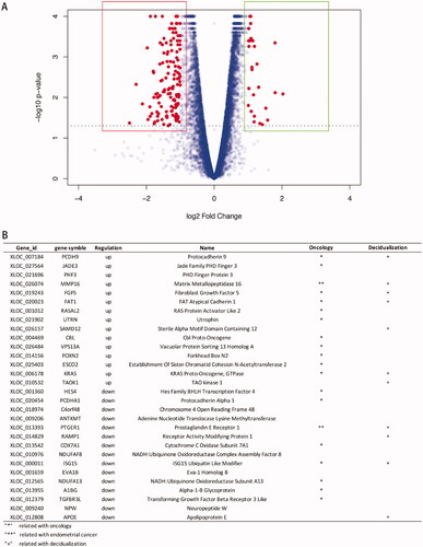
Figure 4. Gene Ontology enrichment analysis of phESCs and ehESCs. GO enrichment results of differentially expressed genes between phESCs and ehESCs are displayed in the bubble plots and include biological process (A), molecular function (B), and cellular component (C). The bubble colour represents the p-value, and the bubble size represents the number of genes in the relevant pathway (see the legend on right-hand side).
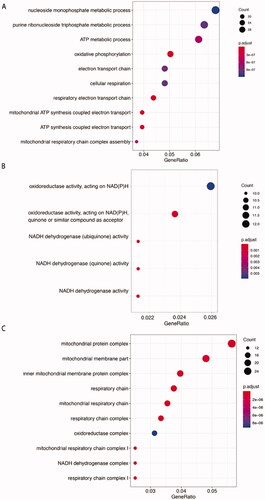
Figure 5. Kyoto Encyclopaedia of Genes and Genomes (KEGG) analysis of phESCs and ehESCs. (A) Bubble plot showing the top nine enriched mRNAs in KEGG pathways. The bubble colour represents the p-value, and the bubble size represents the number of genes in the relevant pathway (see the legend on right-hand side). (B) Twenty common genes were selected that were involved in oxidative phosphorylation, Huntington's disease, Alzheimer's disease, and Parkinson's disease KEGG pathways. The specific genes and classifications are shown in the table. The figure on the right shows the specific function of genes in oxidative phosphorylation. (C) The top four enriched PANTHER pathways and their related genes.
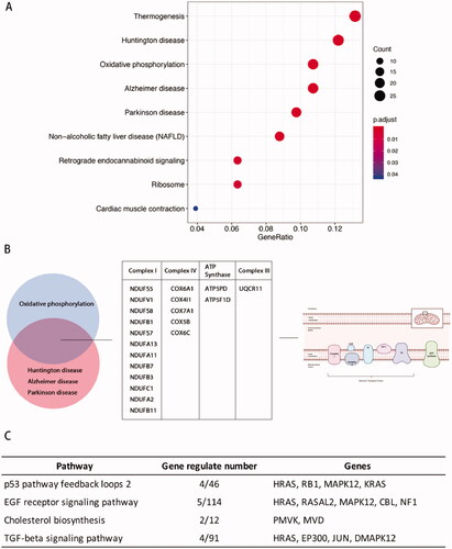
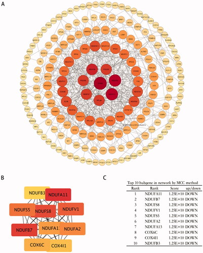
Figure 6. Protein-protein interaction analysis of DEGs. (A) PPI networks of the DEGs based on the STRING database analysis. The size of the node represents the degree of connectedness. The degree of a protein (node) equals the PPI interactions incident to the node in the whole network. The darker the colour and the larger the node, the higher the degree value. (B,C) PPI network of 10 hub genes from (A).
Supplemental Material
Download ()Data availability statement
The datasets used and/or analyzed during the current study are available from the corresponding author on reasonable request or online database.