
Figures & data
Figure 1. Flowchart of study participants.
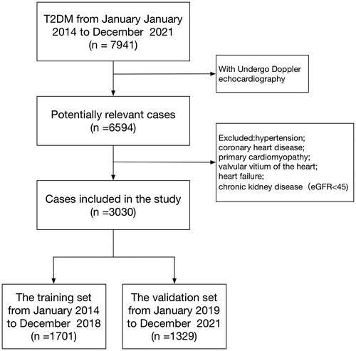
Table 1. The baseline characteristics of T2DM patients in the training and validation sets.
Figure 2. Demographic and clinical feature selection using the LASSO binary logistic regression model. (A) Optimal candidate (Lambda) selection in the LASSO model used 10-fold cross-validation via minimum criteria. The area under the receiver operating characteristic curve was plotted versus log (Lambda). Dotted vertical lines were drawn at the optimal values by using the minimum criteria and the 1 SE of the minimum standards; (B) LASSO coefficient profiles of the 41 candidates. A coefficient profile plot was produced against the log (Lambda) sequence. A vertical line was drawn at the value selected using 10-fold cross-validation, where optimal Lambda resulted in 9 candidates with non-zero coefficients (Lambda = 0.0136).
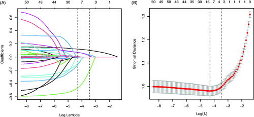
Figure 3. The ROC curves of the Model MFP (AUC-ROC is 0.834), model full (AUC-ROC is 0.833), and Model Stepwise (AUC-ROC is 0.831).
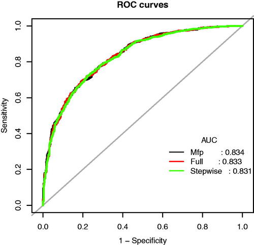
Table 2. Prediction performance the Model MFP, Model Full, and Model Stepwise for the risk of impaired diastolic function in T2DM patients.
Table 3. Multivariable analyses of impaired diastolic function in T2DM patients in the training set.
Figure 4. Nomogram predicting DN. The nomogram was developed in the training dataset with AGE, BMI, TG, CK-MB, Na, and UAER. Points of each variable were acquired by drawing a straight line upward from the corresponding value to the ‘Points’ line. Then sum the points received from each variable and locate the number on the ‘Total Points’ axis. To conclude the patient’s sort probability of having diastolic dysfunction, draw a straight line down to the corresponding ‘Probability of Diastolic Dysfunction’ axis. Units: AGE, years; BMI, kg/m2; TG, mmol/L; CK-MB, ng/mL; Na, mmol/L; UAER, mg/g.
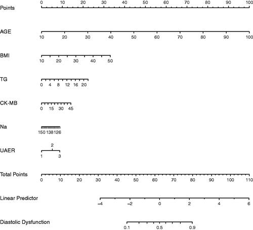
Figure 5. The ROC curves of the Novel model in the training dataset (A) and validation dataset (B).
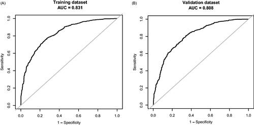
Table 4. Prediction performance of the nomogram for the risk of impaired diastolic function in T2DM patients in the training and validation sets.
Figure 6. Calibration curve of the Novel model in the training dataset (A) and validation dataset (B). The x-axis represents the predicted probability of Diastolic Dysfunction. The y-axis represents the actual diagnosed Diastolic Dysfunction. The diagonal dotted line represents a perfect prediction by an ideal model. The solid line represents the performance of the nomogram, of which a closer fit to the diagonal dotted line means a better prognosis.
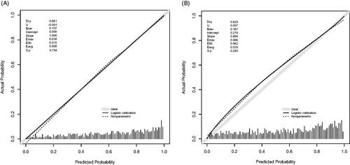
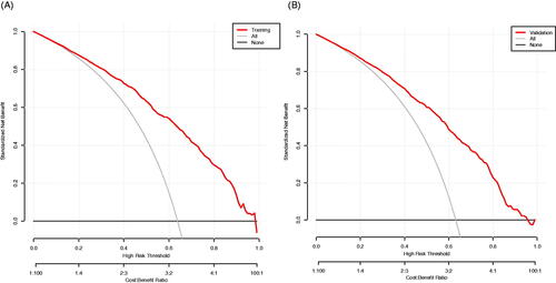
Figure 7. The decision curve analysis of the Novel model in the training dataset (A) and validation dataset (B). The black line represents the net benefit when none of the participants is considered to have Diastolic Dysfunction. In contrast, the light grey line represents the net benefit when all participants are deemed to have Diastolic Dysfunction. The area between the ‘no treatment line’ (black line) and ‘all treatment line’ (light grey line) in the model curve indicates the clinical utility of the model. The farther the model curve is from the black and light grey lines, the better the clinical use of the nomogram.
Supplemental Material
Download MS Word (48.6 KB)Data availability Statement
Data is available on request from the authors. The data supporting this study’s findings are available from the corresponding author D Yan upon reasonable request.