
Figures & data
Figure 1. Combined analysis of bulk-sequencing data and scRNAseq data. (A) Volcano plot representing the identification of differentially expressed genes in HT-YES (hormone-treated PCa patients with recurrence) samples vs. HT-NO (hormone-treated PCa patients without recurrence). Up-regulated genes (p.adj < 0.05, log2fc > 1) are labeled in orange and down-regulated genes (p.adj < 0.05, log2fc < -1) are labeled in blue. (B) Expression status of up-regulated and down-regulated genes across HT-YES and HT-NO samples. (C) Uniform Manifold Approximation and Projection (UMAP) plot showing the distribution patterns of subgroups in each dataset. (D) Bar plot showing the number of cells in each subgroup from each dataset. (E) Dot plot representing the relative expression level (color) and the ratio of gene-expressing cells (size) of all marker genes used in the definition of each subgroup.
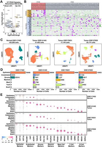
Figure 2. Epithelial component analysis across four datasets. (A) UMAP plot showing the distribution patterns of subgroups in each dataset. (B) Bar plot showing the number of cells in each subgroup from each dataset. (C) Dot plot representing the relative expression level (color) and the ratio of gene-expressing cells (size) of all marker genes used in the definition of each subgroup. (D) Heatmap representing the similarity of expression patterns among different subgroups. The expression pattern is defined as the mean expression values of all genes within one subgroup, and a Pearson correlation analysis is performed to compare the similarity. (E) Bar plot representing the relative ratio of each epithelial subgroup across four datasets.
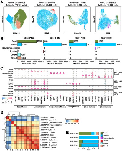
Figure 3. Heterogeneity of cancerous cells across all 4 datasets. (A) Expression status of TCGA module and CPGEA module across all subgroups. A student t.test is performed for each comparison (*, p < 0.05; **, p < 0.01; ***, p < 0.001). (B) Expression of subgroup-featured genes across different subgroups. (C) List of top enriched KEGG terms of featured genes from each subgroup.
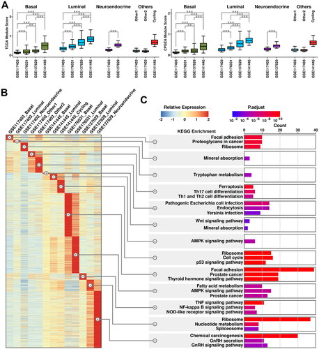
Figure 4. Cross-validation of CRPC-featured genes. (A) Expression status of the 10 up-regulated genes across different subgroups. A student t.test is performed for each comparison (*, p < 0.05; **, p < 0.01; ***, p < 0.001). (B) Dot plot representing the relative expression level (color) and the ratio of gene-expressing cells (size) of 10 up-regulated genes in each subgroup. (C) Immunostaining results showing anti-EPCAM (green) and anti-PEG10 (red) labeled PCa tissues (Patient 1 and Patient 2) and CRPC tissue (Patient 3).
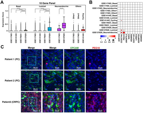
Figure 5. Generation of a 6-gene panel using CRPC-specific epithelial features. (A) Cartoon plot representing the communication intensity between different epithelial subgroups in CRPC samples. (B) List of top 20 LR pairs between different epithelial subgroups in CRPC samples. (C) Expression status of PEG10, CCDC74A, PPIB, GAPDH, AR, and EPCAM across different subgroups. A student t.test is performed for each comparison (*, p < 0.05; **, p < 0.01; ***, p < 0.001). (D) Expression scores of 6-gene panel across different samples in TCGA PRAD cohort. A student t.test is performed for each comparison (*, p < 0.05; **, p < 0.01; ***, p < 0.001). (E) ROC plots representing the performance of the 6-gene panel in separating normal samples from tumor samples, recurrent tumor samples from non-recurrent tumor samples and HT recurrent samples from HT non-recurrent samples. (F) For recurrent tumor samples, left plot: samples with shorter recurrence time (time < = median) have higher (t.test not significant) 6-gene panel scores than samples with longer recurrence time (time > median); middle plot: samples with higher 6-gene panel scores (score > = median) have shorter (t.test not significant) recurrence time than samples with lower 6-gene panel scores (score < median); right plot: pearson correlation between recurrence time and 6-gene panel scores in recurrent tumor samples. (G) For recurrent HT samples, left plot: samples with shorter recurrence time (time < = median) have higher (t.test significant, *, p < 0.05; **, p < 0.01; ***, p < 0.001) 6-gene panel scores than samples with longer recurrence time (time > median); middle plot: samples with higher 6-gene panel scores (score > = median) have shorter (t.test not significant) recurrence time than samples with lower 6-gene panel scores (score < median); right plot: pearson correlation between recurrence time and 6-gene panel scores in recurrent tumor samples.
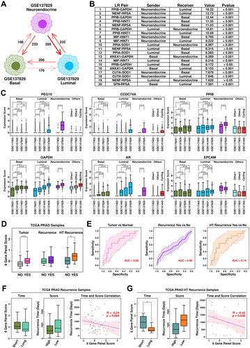
Figure 6. Stroma and myeloid analysis across four datasets. (A) UMAP plot showing the distribution patterns of stroma subgroups in each dataset. (B) Bar plot showing the number of cells in each stroma subgroup from each dataset. (C) Dot plot representing the relative expression level (color) and the ratio of gene-expressing cells (size) of all marker genes used in the definition of each stroma subgroup. (D) Gene expression levels of FAP and TGFB1 across stroma subgroups. A student t.test is performed for each comparison (*, p < 0.05; **, p < 0.01; ***, p < 0.001). (E) UMAP plot showing the distribution patterns of myeloid subgroups in each dataset. (F) Bar plot showing the number of cells in each myeloid subgroup from each dataset. (G) Dot plot representing the relative expression level (color) and the ratio of gene-expressing cells (size) of all marker genes used in the definition of each myeloid subgroup. (H) Gene expression levels of TGFB1, IL10, TNF, and IL1B across myeloid subgroups. A student t.test is performed for each comparison (*, p < 0.05; **, p < 0.01; ***, p < 0.001).
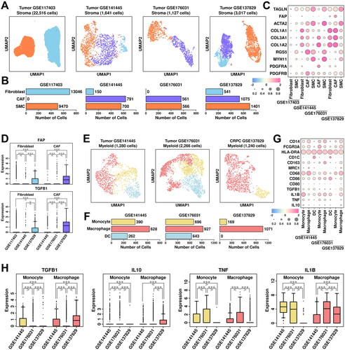
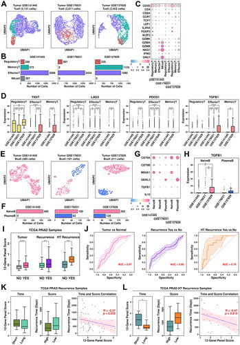
Figure 7. Tcell/Bcell analysis across four datasets and generation of a 12-gene panel. (A) UMAP plot showing the distribution patterns of Tcell subgroups in each dataset. (B) Bar plot showing the number of cells in each Tcell subgroup from each dataset. (C) Dot plot representing the relative expression level (color) and the ratio of gene-expressing cells (size) of all marker genes used in the definition of each Tcell subgroup. (D) Gene expression levels of TIGIT, LAG3, PDCD1, and TGFB1 across stroma subgroups. A student t.test is performed to each comparison (*, p < 0.05; **, p < 0.01; ***, p < 0.001). (E) UMAP plot showing the distribution patterns of Bcell subgroups in each dataset. (F) Bar plot showing the number of cells in each Bcell subgroup from each dataset. (G) Dot plot representing the relative expression level (color) and the ratio of gene-expressing cells (size) of all marker genes used in the definition of each Bcell subgroup. (H) Gene expression levels of TGFB1 across Bcell subgroups. A student t.test is performed for each comparison (*, p < 0.05; **, p < 0.01; ***, p < 0.001). (I) Expression scores of 12-gene panel across different samples in TCGA PRAD cohort. A student t.test is performed for each comparison (*, p < 0.05; **, p < 0.01; ***, p < 0.001). (J) ROC plots representing the performance of the 12-gene panel in separating normal samples from tumor samples, recurrent tumor samples from non-recurrent tumor samples and HT recurrent samples from HT non-recurrent samples. (K) For recurrent tumor samples, left plot: samples with shorter recurrence time (time < = median) have higher (t.test not significant) 121-gene panel scores than samples with longer recurrence time (time > median); middle plot: samples with higher 12-gene panel scores (score > = median) have shorter (t.test not significant) recurrence time than samples with lower 12-gene panel scores (score < median); right plot: pearson correlation between recurrence time and 6-gene panel scores in recurrent tumor samples. (L) For recurrent HT samples, left plot: samples with shorter recurrence time (time < = median) have higher (t.test significant, *, p < 0.05; **, p < 0.01; ***, p < 0.001) 12-gene panel scores than samples with longer recurrence time (time > median); middle plot: samples with higher 12-gene panel scores (score > = median) have shorter (t.test not significant) recurrence time than samples with lower 12-gene panel scores (score < median); right plot: pearson correlation between recurrence time and 12-gene panel scores in recurrent tumor samples.
Supplemental Material
Download Zip (923.7 KB)Data availability statement
The datasets presented in this study can be found in online repositories. The names of the repository/repositories and accession number(s) can be found in the article/Supplementary Material.