
Figures & data
Figure 1. Flowchart of data screening and analysis.
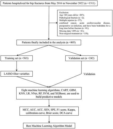
Figure 2. The potential risk factors were selected using the LASSO regression. a: Trend graph of variance filter coefficients. Each colour curve represents a trend in variance coefficient change. b: Graph of cross-validation results. The vertical line on the left side represents λ min, and the vertical line on the right side represents λ 1se. λ min refers to the λ value corresponding to the minimum mean squared error (MSE) among all λ values; λ 1se refers to the λ value corresponding to the simplest and best model obtained after cross-validation within a square difference range of λ min.
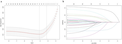
Table 1. Characteristics of patients in the training set.
Figure 3. ROC curves, calibration curves, and DCA curves for each model in the training and validation sets. a: ROC curve in the training set; b: ROC curve in the validation set; c: Calibration curve in the training set; d: Calibration curve in the validation set; e: DCA curve in the training set; f: DCA curve in the validation set.
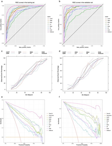
Figure 4. Summary plot of SHAP values for the model constructed by XGBoost algorithm. a: Summary plot of SHAP values in the training set; b: Summary plot of SHAP values in the validation set. The vertical coordinates show the importance of the features, sorted by the importance of the variables in descending order, with the upper variables being more important to the model. For the horizontal position ‘SHAP value’ shows whether the impact of the value is associated with a higher or lower prediction. The colour of each SHAP value point indicates whether the observed value is higher (purple) or lower (yellow).
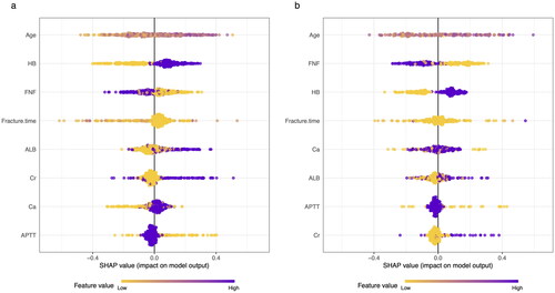
Table 2. Evaluation metrics of the models constructed by each algorithm.
Supplemental Material
Download MS Word (674.5 KB)Availability of data and materials
The datasets analysed during the current study are available from the corresponding author on reasonable request.