
Figures & data
Figure 1. Patient flow diagram.
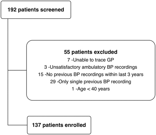
Figure 2. Frequency histogram showing normal distribution of the measured basal MAP and the estimated basal MAP.
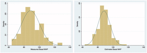
Table 1. Cohort characteristics and key results.
Figure 3. Box plots of the measured and estimated basal systolic BP (A), diastolic BP (B) and mean arterial BP (C). These are vertical box-and-whisker plots, where the central line within the box represents the median value, the two ends of boxes represent the first and the third quartile values, and the two ends of whiskers represent the upper and lower adjacent values.
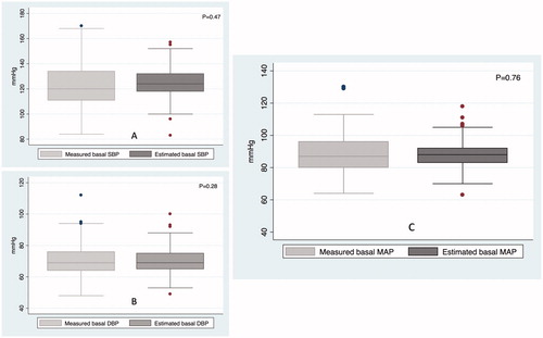
Figure 4. Correlation between the measured and estimated basal systolic BP (A), diastolic BP (B) and mean arterial BP (C). These plots show strength and direction of linear relationship between estimated and measured basal BP values. The Pearson’s r statistic of >0.4 in all the three panels represents fair correlation.
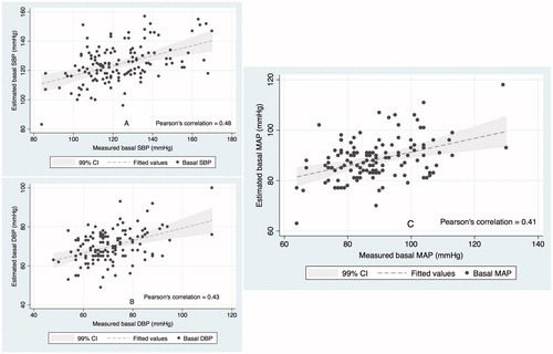
Figure 5. Bland-Altman plots for the measured and estimated basal systolic BP (A), diastolic BP (B) and mean arterial BP (C). These plots demonstrate mean bias and upper and lower agreement limits in each panel. The shaded portion represents the pre-designated precision limits of ±15.7 mmHg, which corresponds to a standard deviation of 8 mmHg [Citation15,Citation16] and are considered acceptable to validate a new BP measuring device against the gold standard.
![Figure 5. Bland-Altman plots for the measured and estimated basal systolic BP (A), diastolic BP (B) and mean arterial BP (C). These plots demonstrate mean bias and upper and lower agreement limits in each panel. The shaded portion represents the pre-designated precision limits of ±15.7 mmHg, which corresponds to a standard deviation of 8 mmHg [Citation15,Citation16] and are considered acceptable to validate a new BP measuring device against the gold standard.](/cms/asset/7a550149-59bb-451c-8630-f24276efae08/iblo_a_1358055_f0005_c.jpg)
Table 2. Comparison between measured and estimated basal MAP in various subgroups.
Table 3. Univariate analysis of variables and the bias between measured and estimated basal MAP.
Table 4. Bias and agreement between measured and estimated basal MAP in different scenarios.