Figures & data
Figure 1. Intraconal orbital fat density as measured in the axial equator plane in a patient with right periorbital cellulitis. The text in the yellow font is automatically extracted from the manually selected area delineated by the yellow surrounding line. AR (area): 26.4 mm2 represents the surface, VA (value): −68 represents the mean hounsfield units (HU) in that area, SD (Standard Deviation): 24.74 represents the standard deviation, and range: −99 to − 3 represents the HU range in that area. The HU were measured for each study participant in 6 separate spaces of the CT scans (nasal and temporal at the axial equator plane, one section above and one below).
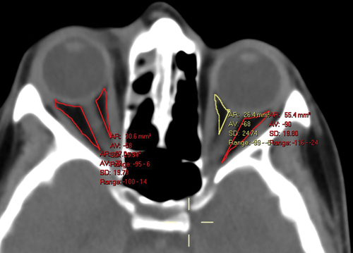
Table 1. Demographics and clinical presentation of 57 patients with a final diagnosis of periorbital cellulitis (POC) or orbital cellulitis (OC). The groups differ in concomitant sinusitis (being higher in the OC Group).
Table 2. Intraconal fat density measured by hounsfield units on Contrast-enhanced Computerized Tomography (CT) in 57 patients with periorbital or orbital cellulitis. Measurements were taken on Axial CT Scan Views and obtained in 6 locations per Patient.a.
Table 3. Difference of Intraconal Fat Density between the nasal and temporal aspects of the orbit as measured by computerized tomography (CT) in 57 patients with periorbital cellulitis or orbital Cellulitis.a.
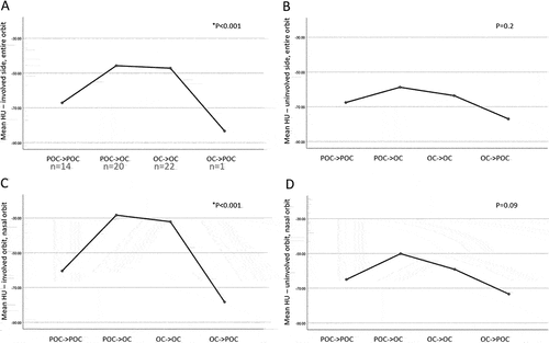
Figure 2. Orbital fat density and alteration in diagnosis from initial to final visit in 57 patients with peri-orbital cellulitis (POC) or orbital cellulitis (OC(. Left, involved orbit, right, uninvolved sides; A,B: entire orbits, C,D: nasal orbits. For the nasal orbits (C,D), these measurements represent the mean HU in the orbit, defined as the mean HU in the nasal superior, nasal at equator, and nasal inferior aspects. For the entire orbits (A,B), these measurements represent the mean HU in all aspects of the orbit (nasal superior, temporal superior, nasal at equator, temporal at equator, nasal inferior, and temporal inferior).