Figures & data
Table 1. Metrics computed for each classification dataset.
Table 2. Mathematical notation and definitions.
Figure 1. Boxplot of the different dataset metrics.
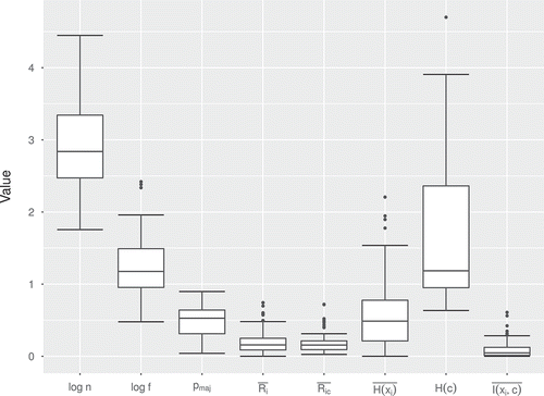
Figure 2. Scatterplots, density estimation and contour plots of the dataset metrics.
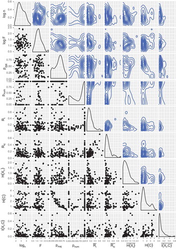
Figure 3. Bi-plots of the first two principal components for the evaluation metrics for each algorithm. The red vectors are the projections of the original metrics onto these components, and each label represents a dataset in these new coordinates.
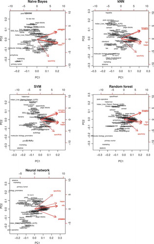
Figure 4. Dataset ranking, as intervals with the minimum, mean and maximum kappa scores among the five algorithms used.
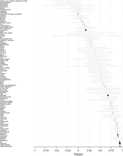
Figure 5. Density estimation for accuracy and kappa for the datasets. In the case of kappa, the red area represents the proportion of datasets with negative kappa, that is, the times that the model is unable to outperform a trivial educated guess.
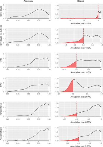
Figure 6. Number of highest/lowest kappa scores for each classifier. The left figure indicates the number of times (normalized to one) a classifier has been the highest (green) and lowest (red) scoring model. The right figure shows their highest/lowest ratios.
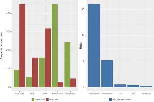
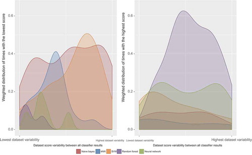
Figure 7. Representation of the (weighted) distribution of the worst (left figure) and best (right figure) performing algorithms according to the variance between the results of the five of them: the datasets with more accuracy/kappa agreement between algorithms lie on the left, whereas the ones with more disagreement are on the right side of the horizontal axis.