Figures & data
Table 1. Comparison of five imputation methods (Linear Regression (LR), Mean Imputation (Mean), Multiple Linear Regression (MLR), Dual Imputation Method (DIM), and Vtreat) in regression tasks using six different regression techniques (Deep Neural Network (DNN) 1, DNN2, k-Nearest Neighbors (kNN), Linear Regression (LR), Random Forests (RF), and XGBoost). The table contains the mean (standard error) values (%) of the R-squared measure and the mean (standard error) values of Root Mean Square Error (RMSE) from 80 independent executions. The best value among imputation methods for each classifier is depicted in bold, and the highest value of all imputation methods for all classifiers is depicted in bold italics
Figure 1. Each radar plot contains the visual representation of the classification results for each imputation method used in this paper. The methods are Mean Imputation (Mean), Linear Regression (LR) imputation, Multi Linear Regression (MLR) imputation, Dual Imputation Model (DIM), and Vtreat imputation. The axes of the radar plots are metrics accuracy, precision, recall, sensitivity, and specificity. Finally, there is one radar plot for each of the classification models utilized. Namely, for the implementation of the Logistic Regression model, the kNN Classification model, the Random Forests model, the XGBoost model, and the two Deep Neural Network models (DNN1 and DNN2).Figure 1(a). Logistic Regression Figure 1(b). kNN Classification Figure 1(c). Random Forests Figure 1(d). XGBoost Figure 1(e). DNN1 Figure 1(f). DNN2
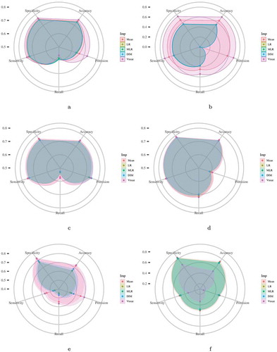
Figure 2. Scatter plots (left column) depict the first two principal components of PCA performed on the five imputed ATHLOS datasets using Linear Regression, Mean, Dual Imputation Model, and Vtreat imputation. Circular points with orange, yellow, and light blue colors illustrate the low, medium, and high HS scores. Above and right to each scatter plot, their data distribution is illustrated. Heatmap-Scatter plots (right column) depict the correlation of predicted and real HS score of the five imputation methods using the Principal Components Regression (PCR) technique. The red to green color graduation of boxes indicates the number of samples from low to high amounts, respectively. Above and right to each heatmap-scatter plot is illustrated the marginal distribution of the HS and the HS estimation as univariate histograms with a density curve on the vertical and horizontal axes of the scatter plot, respectively
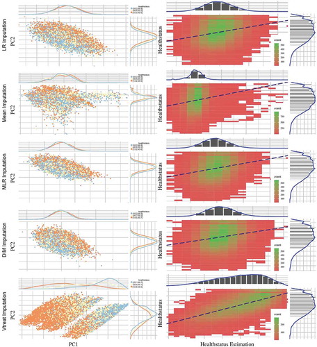
Table 2. Comparison of 5 imputation methods using the Principal Components Regression technique. The table contains the (%) of the R-squared measure and the mean (standard error) values of Root Mean Square Error (RMSE). The best value among imputation methods for each measure is depicted in bold
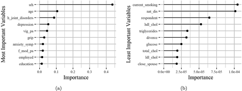
Figure 3. The horizontal bars illustrate the most (left) and the least (right) important variables regarding their effectiveness in the HealthStatus prediction by applying the XGBoost classification algorithm. The x-axis imprints the variable importance score, while the y-axis includes the feature names defined by the ATHLOS project (see supplementary sheet S1)