
Figures & data
Table 1. Field scour data sources in literature that are used in this study
Table 2. Experiment scour data sources in literature that are used in this study
Figure 1. Local scour around bridge pier.
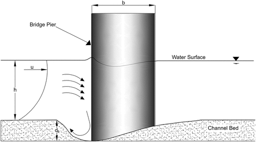
Figure 2. An overview of the method, with each major step is enclosed in dotted rectangles. “Data Preparation” step is applied to all of the categories in the previous step, “Clustering” is applied to every set in the previous step, and “Genetic Programming” is applied to every cluster in the previous step.
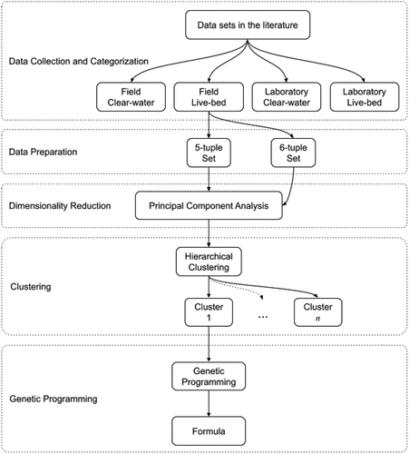
Table 3. Number of observations in each data set using 5-tuple and 6-tuple parameters
Table 4. The resulting clusters for eight data sets. F represents field data, L represents laboratory data, C represents clear-water, and B represents live-bed scour type
Table 5. Our GP uses the following primitives to form its expression tree. We have modified some of the mathematical functions to control the output
Table 6. The hyperparameters for GP
Table 7. Performance output of our method using MSE, RMSE, MAE, MAPE, R2 which denotes the score of the training set, which denotes the score of the validation set, and
which denotes the score of the testing set. The clusters denoted by a
use a maximum tree depth of 16. Values close to 1 are good for
and values close to 0 are good for other metrics. Also,
and
are expected to reduce overfitting
Figure 3. These plots of large clusters show how similar the predicted values are to the observed values. The diagonal line shows perfect fit to data. The plots show that laboratory observations are more controlled and almost evenly distributed while the field data accumulates at a range between 0 and 2, while having larger values occasionally.
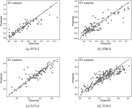
Table 8. The centers of the clusters after hierarchical clustering
Table 9. The performance comparison of our method with formulas HEC-18 (Richardson and Davis Citation2001), Melville (Melville Citation1997), Jain and Fischer (Jain and Fischer Citation1979)
Table 10. Comparison of with and without
parameter for clusters with 6-tuples