Figures & data
Figure 1. Diagram of the data acquisition system showing the various components and pin connections.
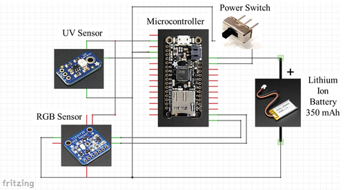
Figure 2. Picture of data acquisition system prototype with key components labeled.
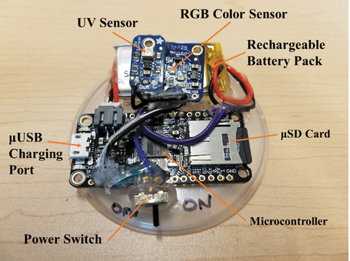
Table 1. Description of data sets
Figure 3. Example indoor (left) and outdoor (right) testing locations with the prototype sensor marked with an orange circle for clarity of the sensor placement.
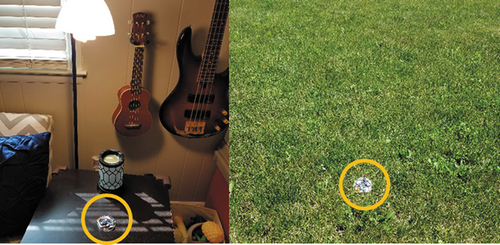
Figure 4. Visual representation of light metrics with fill color representing RGB components and size corresponding to luminosity. Larger markers indicate a higher luminosity, while smaller markers indicate a lower luminosity value. Indoor measurements are marked as orange triangles while outdoor measurements are light blue circles.
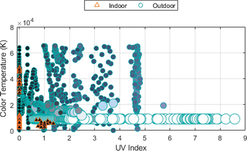
Figure 5. Distribution of data sets using numbering from for outdoor non-zero UV index measurements (left) and indoor measurements with zero UV index (right). The sample containing the median luminosity measurement was selected as a representative example for each data set.
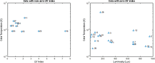
Table 2. Summary of statistics for classifier accuracy on testing data
Table 3. Mean confusion matrix for each classifier on testing data as percentages
Figure 6. Box plot showing distribution of cross-validation for each classifier. The black lines indicate the maximum and minimum values, the blue rectangles indicate the lower and upper quartiles, the red line indicates the median, and the red ‘+’ symbols denote outliers.
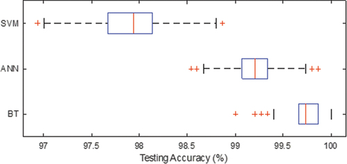
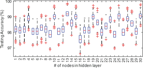
Figure 7. Box plot showing distribution of cross-validation for different numbers of nodes in the hidden layer for the ANN classifier. The black lines indicate the maximum and minimum values, the blue rectangles indicate the lower and upper quartiles, the red line indicates the median, and the red ‘+’ symbols denote outliers.