
Figures & data
Table 1. Overview of the amount variable
Table 2. Accuracy metrics
Figure 1. The ROC curve for Class 1 (fraudulent transactions), along with the respective 95% confidence intervals. The thick dashed (blue) line is the estimated ROC from the training data. Different points on the ROC curve provide a different trade-off between False Positive Rate (FPR) and the true positive rate (sensitivity) of the classifier. JAD can output models operating at different FPRs by selecting any of the circles.
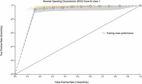
Table 3. The confusion matrix
Table 4. Descriptive statistics of out-of-sample forecasts
Table 5. Comparison to earlier studies