Figures & data
Table 1. Different versions of SAM-kNN Regression that are compared in the experiments.
Table 2. Description of toy data sets.
Figure 1. RMSE values for all SAM versions on all toy data sets. Different colors correspond to different maximum STM sizes. Dark and light shadings correspond to different thresholds for dimensionality reduction.
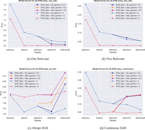
Table 3. RMSE rates on toy data sets with feature drift for all versions of SAM. Errors are given for maximum STM sizes of 50, 250 and 500 data points.
Figure 2. Different Relevance plots for the Two Relevant data set. (a) shows the relevance over time as computed by MLKR. (b) shows the same data as (a) but all values are normalized by the maximum value of each time step. (c) shows the relevance under a smoothed metric. (d) shows the same data as (c) but again normalized.
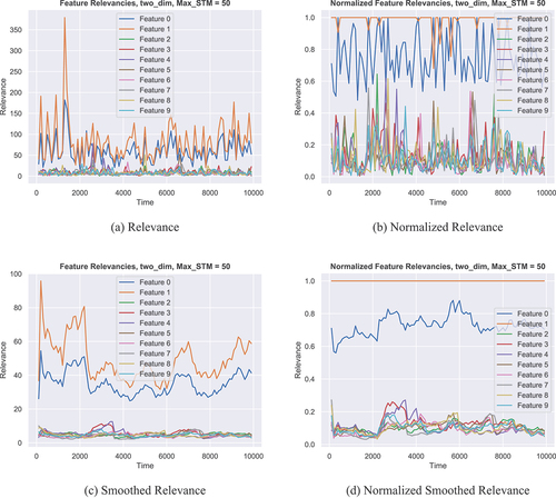
Figure 3. Different Relevance plots for the Continuous Drift data set. (a) shows the relevance over time as computed by MLKR. (b) shows the same data as (a) but all values are normalized by the maximum value of each time step. (c) shows the relevance under a smoothed metric. (d) shows the same data as (c) but again normalized.
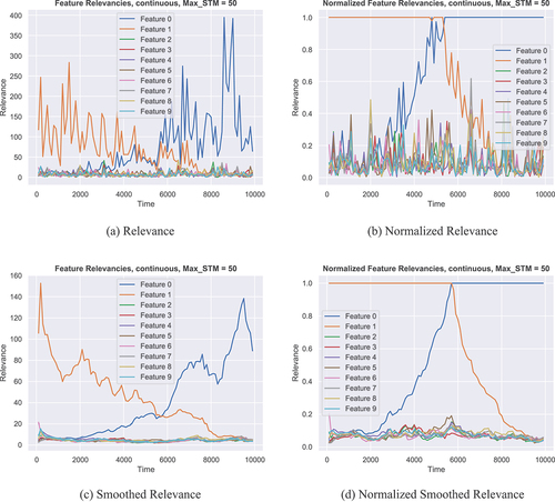
Figure 4. Different Relevance plots for the Abrupt Drift data set. (a) shows the relevance over time as computed by MLKR for a maximum STM size of 50. (b) shows the same as (a) but for a maximum STM size of 500. (c) shows the relevance under a smoothed metric, for a maximum STM size of 50. (d) shows the same data as (c) but again for a maximum STM size of 500.
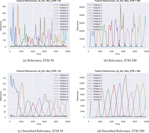
Figure 5. Different Dimensionality Reduction plots for the Abrupt Drift data set. All plots show a point in the grid for each feature that was left over after dimensionality reduction at any given point in time. (a) and (c) show a reduction strategy where the number of leftover features is determined by a threshold. (b) and (d) show a strategy where we always reduce down to two leftover features. Again, the top row shows the situation without metric smoothing, while the bottom row shows the other side.
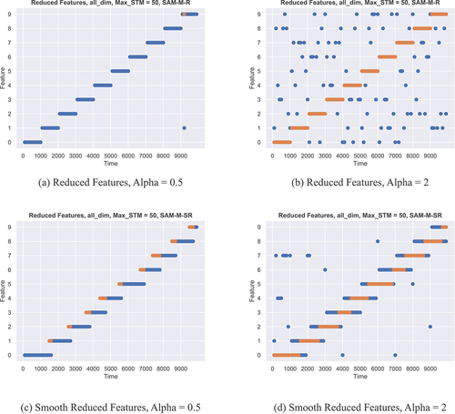
Figure 6. L-Town Water Distribution Network as given by Vrachimis et al. (Citation2020). (a) shows the different areas of the network. (b) shows the placement of pressure sensors inside the network.
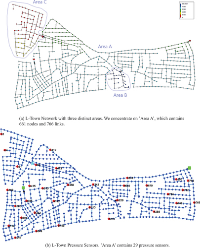
Table 4. Description of the WDN scenarios used in the real-world experiment. The last column describes how a sensor fault is simulated in the data.
Table 5. Average RMSE rates for different versions of SAM. SAM-M-R reduces the dimension down to 10. The RMSE values are averaged over all virtual sensors in each scenario.
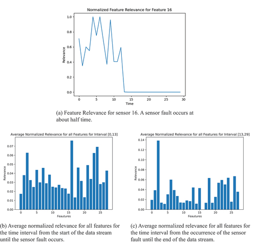
Figure 7. Relevance of pressure sensors in scenario 1. (a) Relevance over time of the sensor experiencing the fault. (b) Relevance picture before the sensor fault (note, that sensor 16 is the most important). (c) Relevance picture after the sensor fault (note, that sensor 16 is the least important).