
Figures & data
Figure 1. Participants’ flow diagram.
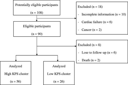
Figure 2. Three-dimensional plot using the Karnofsky Performance Status scores from 2015 to 2017 based on K-means clustering algorithm. High KPS cluster, navy dots; low KPS cluster, maroon dots.
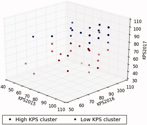
Table 1. Baseline characteristics of hemodialysis patients categorized by KPS cluster (derived from KPS scores between 2015 and 2016) (N = 82).
Table 2. Logistic regression for KPS cluster (derived from KPS scores between 2015 and 2017) (N = 82)
Data availability statement
The raw data used to support the findings of this study are available from the corresponding author upon reasonable request.