
Figures & data
Figure 1. A representative example of shear wave elastography imaging (A) and histopathological analysis using various stainings (B-E). (A) A color-coded shear wave elastogram and a corresponding conventional ultrasound image of a patient with chronic kidney disease. Images of a 10× objective kidney biopsy stained with (B) hematoxylin-eosin stain, (C) Masson’s trichrome stain, (D) periodic acid-Schiff stain, and (E) methenamine silver stain taken from this patient.
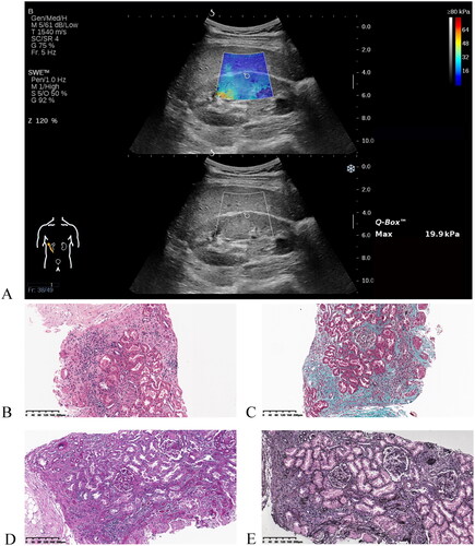
Table 1. Index of renal fibrosis pathology grade.
Table 2. Demographic and clinical characteristics of patients with CKD in the training and test sets.
Table 3. Diagnostic performance of the MLP model.
Figure 2. The established multilayer perceptron model consists of an input layer, a hidden layer, and an output layer.
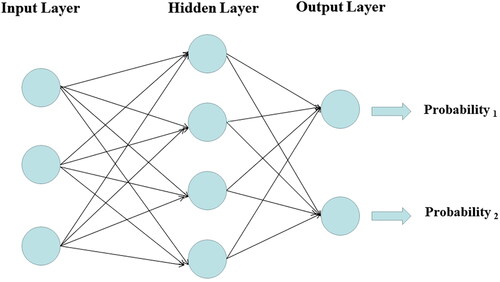
Figure 3. The relative importance of each predictor variable in the multilayer perceptron model. The longer the bar is represented by the variable, the greater the relative contribution of the variable to the model. SWE: shear wave elastography; eGFR: estimated glomerular filtration rate; UACR: urinary albumin creatinine ratio; RI: resistive index; BUN: blood urea nitrogen; BMI: body mass index.
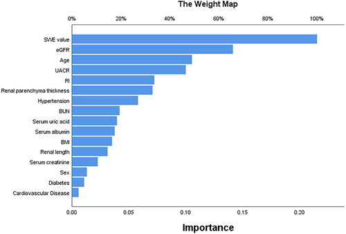
Figure 4. Receiver operating characteristic curves for differentiating moderate-severe renal fibrosis from mild one in the training (A) and test cohorts (B).
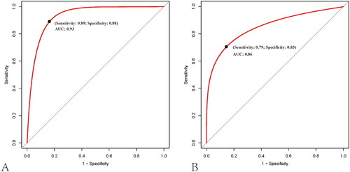
Figure 5. Water-fall plots constructed by the multilayer perceptron model in the training (A) and test cohorts (B). The blue area below the threshold indicates individuals with moderate-severe impairment who were misclassified as having mild impairment. The pink part above the threshold indicates individuals with mild impairment who were misclassified as moderate-severe impairment.
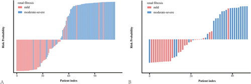
Figure 6. Calibration curves of the multilayer perceptron model prediction in the training (A) and test cohorts (B). Calibration curves depict the calibration of the established model in terms of the agreement between the predicted risks of moderate-severe renal pathological impairment and the observed outcomes of moderate-severe impairment. The y-axis shows actual moderate-severe impairment diagnoses, and the x-axis indicates the predicted moderate-severe impairment risk. The diagonal dotted line represents a perfect prediction by an ideal model. The solid line represents the performance of the model; a closer fit to the diagonal dotted line represents a more accurate prediction.
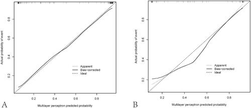
Figure 7. Decision curve analysis curves for the multilayer perceptron model in the training (A) and test cohorts (B). The y-axis shows the net benefit, and the x-axis indicates the risk threshold. The red line represents the prediction model. The blue line represents the assumption that all patients have moderate-severe renal pathological impairment. The black line depicts the assumption that none of the patients suffer from moderate-severe impairment. The net benefit was calculated by subtracting the proportion of false-positive patients from the proportion of true-positive patients, weighted by the relative harm of forgoing treatment compared with the negative consequences of unnecessary treatment.
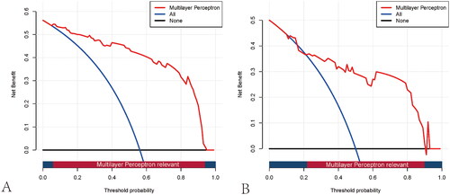
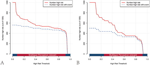
Figure 8. Clinical impact curves of the multilayer perceptron model in the training (A) and test cohorts (B). The y-axis measures the number of individuals at high risk, and the x-axis measures the risk threshold. The red curve shows how many out of 1000 patients the prediction model classifies as positive (high-risk) at each probability threshold. In contrast, the blue curve shows the number of true positives at each probability threshold.
Supplemental Material
Download PDF (112 KB)Data availability statement
The data presented in this study are available from the corresponding author upon reasonable request. Data are not publicly available due to privacy or ethical concerns.