
Figures & data
Figure 1. The flowchart of patient selection. MIMIC IV: Medical Information Mort for Intensive Care IV; ICU: intensive care unit; CKD: chronic kidney disease; LIME: Local Interpretable Model-Agnostic Explanations.
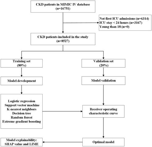
Table 1. Demographic and clinical characteristics at baseline.
Figure 2. ROC curves for the ML models and the traditional severity of illness scores to predict in-hospital mortality. (A) ROC curves for the six ML models used to predict in-hospital mortality; (B) ROC curves for the traditional severity of disease scores used to predict in-hospital mortality. ROC: receiver operating characteristic; SVM: support vector machine; KNN; k-nearest neighbors; AUC: area under the curve; SOFA: sequential organ failure assessment; SAPS II: simplified acute physiology score II.
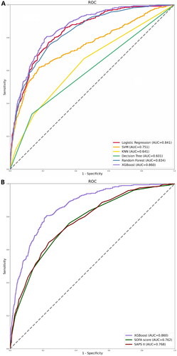
Table 2. Performance comparison of the machine learning models in the testing set.
Figure 3. The top 20 important features derived from the XGBoost model. SHAP indicates the importance of ranking features. Each line represents a feature, and the abscissa is the SHAP value. The matrix plot represents the significance of each covariate in constructing the final predictive model. The higher the SHAP value for each clinical variable, the higher risk of death. SHAP: SHapley Additive exPlanations; SOFA: sequential organ failure assessment; SAPS II: simplified acute physiology score II; BUN: blood urea nitrogen; SpO2: oxygen saturation; MAP: mean arterial pressure; PTT: partial thromboplastin time.
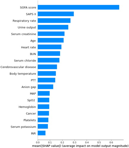
Figure 4. SHAP summary plot of the top 20 features of the XGBoost model. The importance matrix plot of clinical variables is derived using the XGBoost model. The matrix plot ranks the importance of the variables, revealing the contribution of each variable to death vs. survive. The greater the SHAP value of a characteristic, the greater the likelihood of death development. The abscissa represents the SHAP value, and each line represents a feature. Red dots indicate greater feature values, whereas blue dots indicate lower feature values. SHAP: SHapley Additive exPlanations; SOFA: sequential organ failure assessment; SAPS II: simplified acute physiology score II; BUN: blood urea nitrogen; SpO2: oxygen saturation; MAP: mean arterial pressure; PTT: partial thromboplastin time.
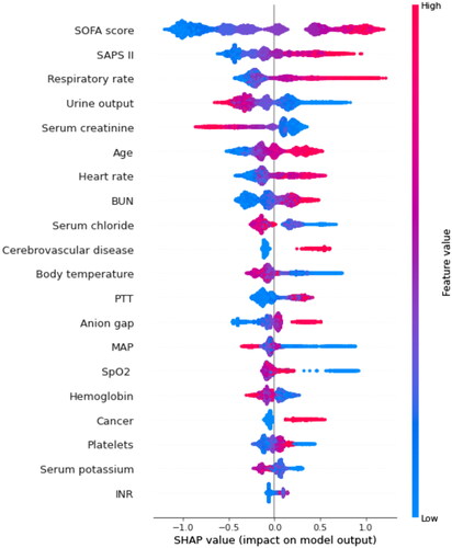
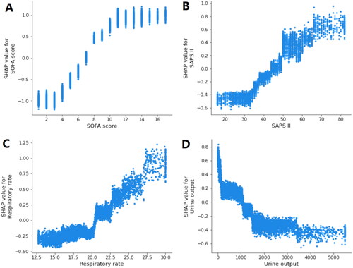
Figure 5. SHAP dependence plot of the XGBoost model. (A) SOFA score; (B) SAPS II; (C) respiratory rate; (D) urine output. SHAP values for specific features exceed zero, representing an increased risk of death. The greater the SHAP value of a characteristic, the greater the likelihood of death development. SHAP: SHapley Additive exPlanations; SOFA: sequential organ failure assessment; SAPS II: simplified acute physiology score II.
Supplemental Material
Download PDF (497.8 KB)Data availability statement
The datasets presented in the current study are available in the MIMIC-IV database (https://physionet.org/content/mimiciv/1.0/).