Figures & data
Figure 1. The OPLS-DA-generated score plots and volcano plots depict samples from Group 1 (depicted by green circles) and Group 2 (depicted by blue circles) after kidney transplantation. The analysis contrasts data from the first week (1 W) and the third month (3 M) following kidney transplantation in the ESI-positive mode. (A,B) showcases volcano plots for Group 1 and Group 2 during the first week (A) and the third month (B) post-kidney transplantation. (C,D) demonstrates the outcomes of the OPLS-DA model for Group 1/Group 2 in the first week (C) and Group 1/Group 2 in the third month after kidney transplantation in ESI-mode (D). in these figures, ‘QC’ denotes the quality control sample, ‘1 W’ represents the first week, and ‘3 M’ represents the third month.
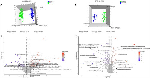
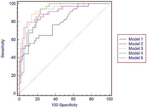
Figure 2. ROC curves of Model 1. Model 2. Model 3. Model 4 and Model 5 in the 1st week after kidney transplantation.
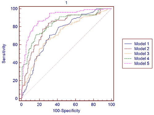
Figure 3. ROC curves of Model 1, Model 2, Model 3, Model 4, and Model 5 at the 3rd month after kidney transplantation.