Figures & data
Figure 1. Schematic diagram of the search process.
Table 1. Data sources, selection and extraction details.
Table 2. The functions and results of each link in the ‘DEAN’ process.
Figure 2. Analysis of the type and quantity of publications. (A) Types of publications. (B) The annual number and cumulative publications related to this topic.
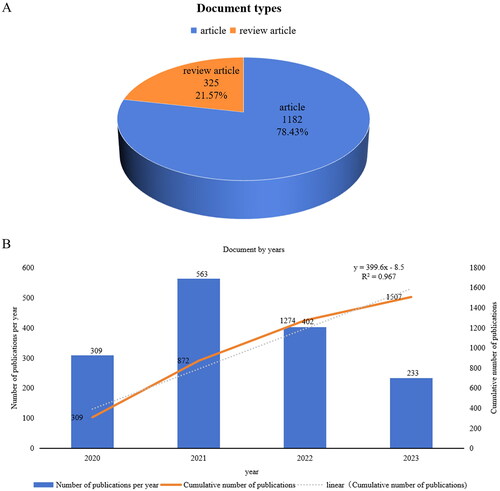
Figure 3. Analysis of the authors and co-cited authors. (A) VOSviewer network map of authors. (B) VOSviewer network map of co-cited authors. (A) Author clustering view. Each node represents an author, and the larger the node, the more the number of articles published by the author. The thickness of the edge of the connection node represents the correlation strength between the two authors, which is measured by the frequency of co-occurrence in the same article. Node colors represent different clusters. (B) Co-citation author clustering view. Each node represents an author, and the larger the node, the higher the citation rate of the author’s article. The thickness of the edge of the connection node represents the correlation strength between the two authors, which is measured by the frequency of co-occurrence in the same article. Node colors represent different clusters.
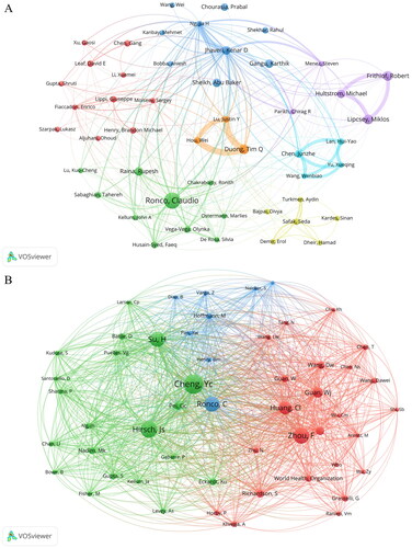
Table 3. The top 10 most publication authors in the field of COVID-19 AKI.
Table 4. The top 10 co-cited authors in the field of COVID-19 AKI.
Figure 4. Analysis of the institutions. (A) Cluster view. (B) Density view. (A) Institutional clustering view. Each node represents an institution, and the size of the node is proportional to the number of publications of the institution. The thickness of the link between the nodes reflects the intensity of cooperation between the corresponding institutions. Node colors represent different clusters. (B) Institutional density view. The progress from cold to warm colors represents an increase in the number and importance of institutional publications.
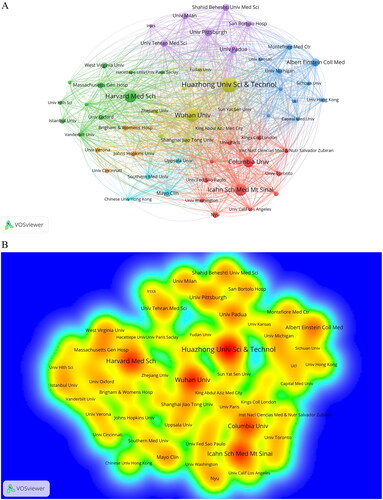
Table 5. The top 10 most publication organizations in the field of COVID-19 AKI.
Figure 5. Analysis of the countries. (A) Cluster view generated by VOSviewer. (B) Network diagram generated by citespace. (A) National clustering view. Each node represents a country, and the size of the node is proportional to the number of publications in the country. The width of the links between nodes corresponds to the intensity of cooperation between the corresponding countries. Node colors represent different clusters. (B) Country analysis. Each node represents a country, and the size of the node is proportional to the amount of literature in the country. The width of the links between nodes reflects the intensity of cooperation between the corresponding countries. The darker the color of the node, the earlier the literature of the country appears. In addition, the nodes covered by the purple circle in the figure represent high centricity (greater than or equal to 0.1).
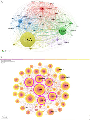
Table 6. The top 10 most publication countries in the field of COVID-19 AKI.
Figure 6. Analysis of the journals. (A) VOSviewer network map of journals. (B) The dual-map overlay of COVID-19-related AKI. (A) Journal clustering view. Each node represents a journal, and the size of the node is proportional to the number of publications in the journal. The width of the links between nodes reflects the strength of cooperation between the corresponding journals. Node colors represent different clusters. (B) Double graph overlay of journals. Each point represents a journal. The map is divided into two parts. The left side is the citation map, the right side is the cited map, the curve is the citation curve, the length of the ellipse represents the number of authors, the width of the ellipse represents the number of publications, and the curve between the left and right parts of the map is the citation link.
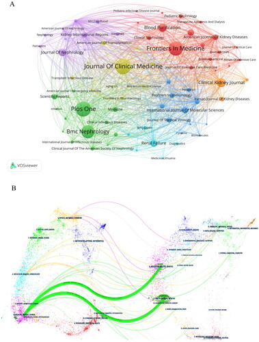
Table 7. The top 10 most publication journals in the field of COVID-19 AKI.
Table 8. The top 10 most citation journals in the field of COVID-19 AKI.
Figure 7. Keyword co-occurrence analysis. (A) Cluster view. (B) Density view. (A) Each node represents a key phrase. The larger the node is, the higher the frequency of keywords is. The thickness of the edge of the connection node represents the correlation strength between the two keywords, which is measured by the frequency of co-occurrence in the same literature. Node colors represent different clusters. (B) Keyword density view. The progress from cold color to warm color represents the increase of keyword frequency.
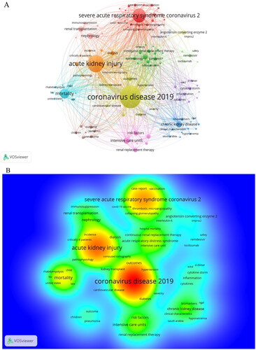
Table 9. The top 20 keywords by co-occurrence frequency in the field of COVID-19 AKI.
Table 10. The top 10 co-cited references in the field of COVID-19 AKI.
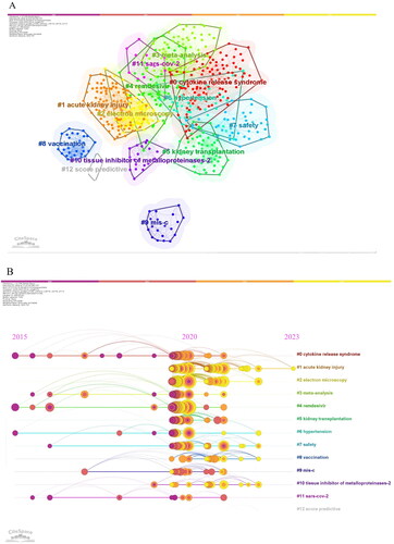
Figure 8. Analysis of co-cited references. (A) CiteSpace network map of cluster diagram of co-cited references. (B) CiteSpace network map of clustering timeline view of co-cited references. (A) Visual network of co-cited clustering in literature. Tags represent clustering analysis topics, where each node corresponds to a document. The color of the node indicates the release date of the document, and the darker color indicates the earlier release date. (B) Visual representation of 13 clustering timelines. The literatures with the same clustering are arranged on the same horizontal line. Each node represents a document, and the node size is proportional to the co-cited frequency of the document. The publication time of the literature is expressed in color, and the darker the color, the earlier the publication time.