Figures & data
Table 1. Summary of the GCMC programs studied.
Figure 1. (Colour online) Illustration of the procedure for the location of the equilibration stage in an MC simulation. Data taken from a simulation at 70 kPa, forcefield setup 1, performed using Music. The blue line represents the rolling mean of the number of adsorbed molecules (over 20,000 steps) as a function of the number of MC steps. Instantaneous values of the number of adsorbed molecules are not shown for clarity. The vertical dotted line indicates the final half of the data-set, the horizontal black dashed line represents the value of the mean from this region while the red dashed line underneath corresponds to two standard deviations below the mean. The red dot delineates the equilibration and sampling stages, according to the procedure described in the text.
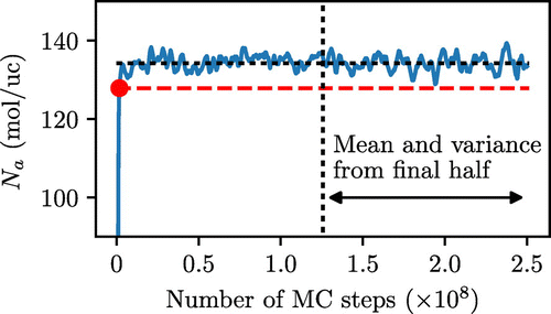
Figure 2. (Colour online) Illustration of the fitting of the ACF to an exponential decay, using the same data shown in Figure . The blue section indicates the portion used for the fitting, while the red section indicates the discarded portion of the function. The truncation point is shown as black dashed lines. Black dotted line indicates the function estimated by the fitting procedure.
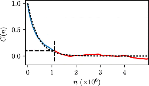
Figure 3. (Colour online) Example of the BSE approach applied to the same data shown in Figures and .
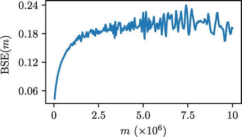
Figure 4. (Colour online) Adsorption isotherms for in IRMOF-1 at 208 K, simulation data taken from the Raspa results. Solid black: experimental isotherm [Citation24], Dash dotted red: Forcefield setup 1, Dashed blue: Forcefield setup 2 and Dotted green: Forcefield setup 3.
![Figure 4. (Colour online) Adsorption isotherms for in IRMOF-1 at 208 K, simulation data taken from the Raspa results. Solid black: experimental isotherm [Citation24], Dash dotted red: Forcefield setup 1, Dashed blue: Forcefield setup 2 and Dotted green: Forcefield setup 3.](/cms/asset/630a9878-4995-4c18-8d69-82a928bd625a/gmos_a_1375492_f0004_oc.gif)
Figure 5. (Colour online) Comparison of the number of steps to reach equilibrium (), statistical inefficiency (g) and standard simulation length (
) for all programs. Lower values indicate fewer steps required to equilibrate and sample. Circles: Setup 1; Diamonds: Setup 2; Triangles: Setup 3. Unfilled markers indicate the use of energy biasing through energy grids. Results for two pressures are shown, with the full results given in Supplementary Material.
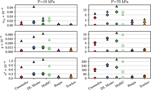
Figure 6. (Colour online) Top panel: time required to reach equilibrium, . Middle panel: time required to perform 1 M sampling steps. Bottom panel: time required to produce g sampling steps. Legend as in Figure , unfilled markers indicate the use of energy grids. Results for two pressures are shown, with the full results given in Supplementary Material.
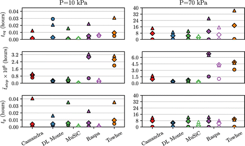
Table 2. Adsorption isotherm data for each program, reported as molecules per unit cell together with the standard error (, where
is the standard deviation and n the sample size). All results were generated using data from a standard length simulation (
).
Figure 7. (Colour online) The total time required to run an entire isotherm of eight pressure points using standard simulation length. Legend as in Figure , with unfilled markers showing the results for simulations using energy grids.
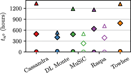
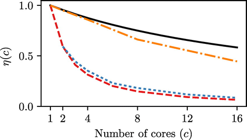
Figure 8. (Colour online) Comparison of the efficiency of parallel computation in different programs, measured for forcefield Setup 3 at 70 kPa. Task based efficiency (as defined in Equation (Equation19(19) )) is shown in solid black for a
ratio of 20. Cassandra: red dashed line; DL Monte: blue dotted line; Towhee: orange dash-dotted line.