Figures & data
Figure 1. The experimental setup with the potato and pressure sensor [left] and an illustration of this in the module [right].
![Figure 1. The experimental setup with the potato and pressure sensor [left] and an illustration of this in the module [right].](/cms/asset/5b498f8a-03f3-4897-bffe-dc5dc5a75a55/tsed_a_2260064_f0001_oc.jpg)
Table 1. Timeline of classroom implementation. The * represents the analysed portion of the case study. Students also took pre/post assessments (1 class day for each).
Table 2. Instances of students asking questions about the data and how adults scaffolded student questions.
Figure 2. A representative graph showing what students saw when they were collecting data on the first day about 45 s after data collection started.
Note: This is a recreation.
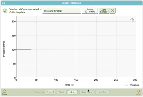
Figure 3. The teacher rescaled the data to show the correct scale, but the students did not seem to recognise their data when it was projected on the board.
Note: The graph was recreated by the authors from the same student data table and scaled to match the image from classroom video.
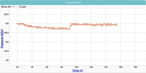
Figure 4. The graph that the students produced when they seem to have accidentally rescaled the data before the first author approached the group. The graph oscillates, jumping between two values that represent miniscule changes in pressure, because the sensor is approaching its resolution limit.
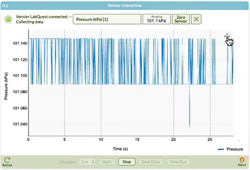
Figure 5. What was on screen on Day 2 when the researcher/first author approached the group. Note the small ‘bump’ at approximately 160 s.
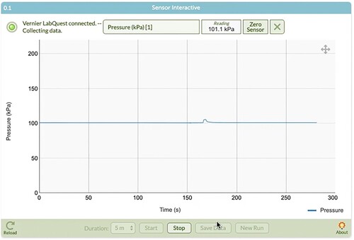
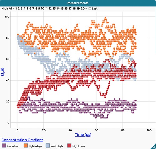
Figure 6. The graphs that the students produced with a simulation that explores diffusion across a cellular membrane.