
Figures & data
Table 1. BMI, hormone, and metabolic parameters between the COM and MF group.
Figure 1. Relative abundance of microbes at the phylum level: (A) community Bar plot analysis of the patients with obesity with PCOS at the baseline and after treatment compared with the healthy subjects; (B) The percentage of Firmicutes in each group (p = .736); (C) The percentage of Bacteroidetes in each group (p = .069); (D) The percentage of Uroviricota in each group (p = .332); (E) The percentage of Actinobacteria in each group (p = .909); (F) The percentage of Proteobacteria in each group (p = .993).
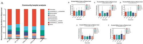
Figure 2. Relative abundance of microbes at the genus level: (A) community Bar plot analysis of the patients with obesity with PCOS at the baseline and after treatment compared with the healthy subjects; (B) Difference test bar charts of the top six species in abundance in the COM group: (a): The percentage of Phocaeicola in each group (p = .0016). (b): The percentage of Hungatella in each group (p = .043). (c): The percentage of Oscillospira in each group (p = .028). (d): The percentage of Flavonifractor in each group (p = .0057). (e): The percentage of Lactococcus in each group (p = .032). (f): The percentage of Anaerotignum in each group (p = .0019); (C) Difference test bar charts of the top six species in abundance in the MF group: (a): The percentage of Bacteroides in each group (p = .034). (b): The percentage of Clostridium in each group (p = .017). (c): The percentage of Phocaeicola in each group (p = .012). (d): The percentage of Parabacteroides in each group (p = .011). (e): The percentage of Hungatella in each group (p = .025). (f): The percentage of Oscillospira in each group (p = .0095).
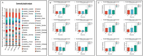
Figure 3. Relative abundance of microbes at the species level: (A) community Bar plot analysis of the patients with obesity with PCOS at the baseline and after treatment compared with the healthy subjects; (B) Difference test bar charts of the top eight species in abundance in the COM group: (a): The percentage of Phocaeicola_vulgatus in each group (p = .036). (b): The percentage of Phascolarctobacterium in each group (p = .042). (c): The percentage of Roseburia_intestinalis in each group (p = .030). (d): The percentage of Hungatella hatheway in each group (p = .045). (e): The percentage of uncultured_Clostridium_sp. in each group (p = .014). (f): The percentage of Bacteroides_uniformis in each group (p = .013). (g): The percentage of Roseburia_hominis in each group (p = .044). (h): The percentage of Lachnospira_eligens in each group (p = .031); (C) Difference test bar charts of the top eight species in abundance in the MF group: (a): The percentage of unclassified_g_Clostridium in each group (p = .030). (b): The percentage of Hungatella_hathewayi in each group (p = .035). (c): The percentage of Bacteroides_uniformis in each group (p = .007). (d): The percentage of Roseburia_hominis in each group (p = .038). (e): The percentage of Parabacteroides in each group (p = .015). (f): The percentage of Roseburia_intestinalis in each group (p = .035). (g): The percentage of Phocaeicola_coprocola _uniformis in each group (p = .025). (h): The percentage of Clostridium_leptum in each group (p = .043).
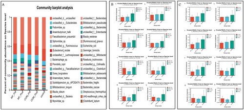
Figure 4. Principal-component-analysis (PCoA) score plots for participants with obesity with PCOS and healthy people. A: PCoA score plots at the phylum level before and after 12-week intervention in the MF and control group; B: PCoA score plots at the genus level before and after 12-week intervention in the MF and control group; C: PCoA score plots at the species level before and after 12-week intervention in the MF and control group; D: PCoA score plots at the phylum level before and after 12-week intervention in the COM and control group; E: PCoA score plots at the genus level before and after 12-week intervention in the COM and control group; F: PCoA score plots at the species level before and after 12-week intervention in the MF and control group.
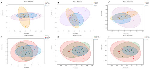
Figure 5. Linear discriminant analysis (LDA) effect size in groups. The X-axis represents LDA score (Log10) and the Y-axis represents significantly different fecal bacterial species (LDA score > 2). The LDA discriminant histogram counts the microbial groups that have a significant effect in three groups. The larger the LDA score, the greater the effect of species abundance on the difference. (A) Histogram of the LDA scores computed for differentially abundant species between the control and MF group at baseline and week 12. (B) Histogram of the LDA scores computed for differentially abundant species between the control and COM group at baseline and week 12. (C) Histogram of the LDA scores computed for differentially abundant species between the control, MF, and COM group at week 12.
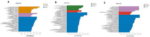
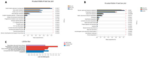
Figure 6. Kruskal–Wallis H test bar plot and linear discriminant analysis (LDA) effect size (LEfSe) of KEGG pathways in groups. (A) Kruskal–Wallis H test bar plot of metabolic pathways between the control and MF groups at baseline and week 12. (B) Kruskal–Wallis H test bar plot of NR between the control and COM groups at baseline and week 12. (C) LEfSe analysis of metabolic pathways between the control, MF and the COM groups at week 12.
Availability of data and materials
The datasets used and/or analyzed during the current study are available from the corresponding author on reasonable request.