
Figures & data
Figure 1. Contribution and global distribution of countries. A: The countries with a minimum number of 17 papers. B: Global map of countries with a minimum number of 17 papers. Nodes represent countries, and the larger the node, the higher the number of papers. The lines represent the association between countries, the thicker the line indicates the stronger association. Color represents clustering, and nodes with the same color belong to the same cluster.
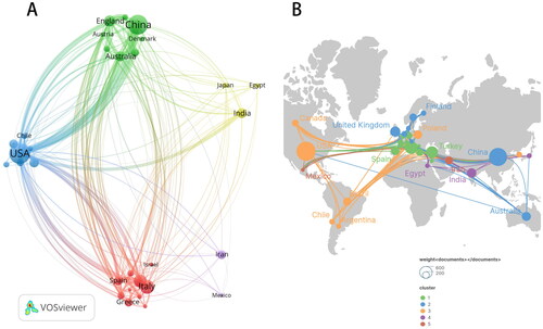
Table 1. Top 10 countries with most publications.
Figure 2. Contribution of institutions with a minimum number of 17 papers. Nodes represent institutions, and the larger the node, the higher the number of papers. The lines represent the association between institutions, the thicker the line indicates the stronger association. Color represents clustering, and nodes with the same color belong to the same cluster.
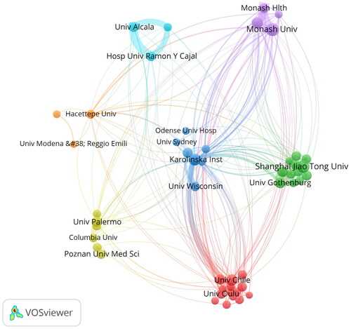
Table 2. Top 10 institutions with most publications.
Figure 3. Contribution of authors with a minimum number of 9 papers. A: The network visualization map of these authors formed 22 clusters. B: Chart of average year of author publication. Nodes represent authors, and the larger the node, the higher the number of papers. The lines represent the association between authors, the thicker the line indicates the stronger association. Color represents clustering, and nodes with the same color belong to the same cluster.
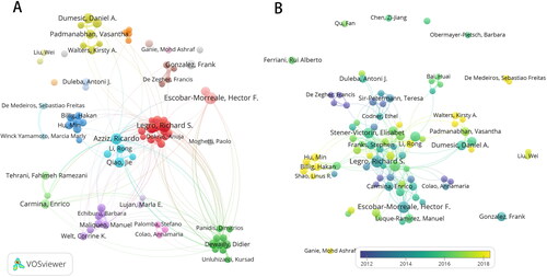
Table 3. Top 10 authors with most publications and highest co-cited authors.
Figure 4. Contribution of journals with a minimum number of 10 papers. A: The network visualization map of these journals formed 6 clusters. B: Chart of average year of journal publication. Nodes represent journals, and the larger the node, the higher the number of papers. Color represents clustering, and nodes with the same color belong to the same cluster.
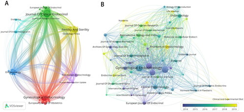
Figure 5. Co-cited papers. A: Visualization of co-cited papers with a minimum number of 100 citations. B: Connectivity analysis of papers based on Citespace formed 12 domains. The node represents the paper, and the larger the node, the higher the number of citations. A line indicates that two papers are cited at the same time, and a thicker line indicates more co-citations. Color represents clustering, nodes with the same color belong to the same cluster.
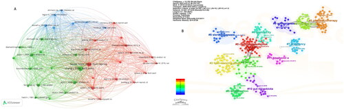
Figure 6. Map of high-frequency keywords. A: Visualization of top 100 keywords formed 4 clusters. B: Average year of top 100 keywords occurrence. Nodes represent keywords, and the larger the node, the higher occurrence of the keyword. Color represents clustering, and nodes with the same color belong to the same cluster.
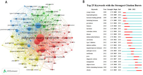
Table 4. Top 10 most frequently occurring keywords in each of the top 100 keywords cluster.
Supplemental Material
Download PDF (310.3 KB)Data availability statement
The data that support the findings of this study are available from the corresponding author, [WGH], upon reasonable request.