Figures & data
Figure 1. Cumulative confirmed COVID-19 deaths per 100,000 population (data up to February 23, 2021 and up to September 21, 2021).
Source: Johns Hopkins University & Medicine, Coronavirus Resource Centre (https://coronavirus.jhu.edu/data/mortality). NL = The Netherlands; NZ = New Zealand; Switz = Switzerland. The same in all subsequent figures. See (Appendix).
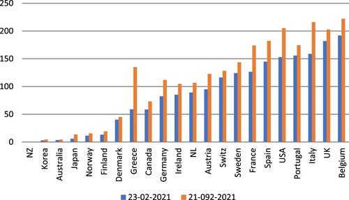
Figure 2. Scatterplot of additional public spending versus cumulative confirmed COVID-19 deaths per 100,000 population.
Sources: Data on additional (discretionary) public spending (as percentage of GDP, until January 2021) are from the IMF (Citation2020) October 2020 Fiscal Monitor Database of Fiscal Measures in response to COVID-19; data on COVID-19 mortality are from Johns Hopkins University & Medicine, Coronavirus Resource Centre (https://coronavirus.jhu.edu/data/mortality); data up to February 23, 2021. Notes: (1) average additional public spending (as percentage of GDP) is 7.2% for the panel of 22 OECD countries; the figure reports country-wise deviations from this average; (2) the unweighted average cumulative confirmed COVID-19 mortality is 86.4 deaths per 100,000 population for the panel of 22 OECD economies; the figure reports deviations from this average. (3) the estimated linear relationship is negative and statistically significant at 2.5% (when I exclude the observations for the U.K. and the U.S. from the regression).
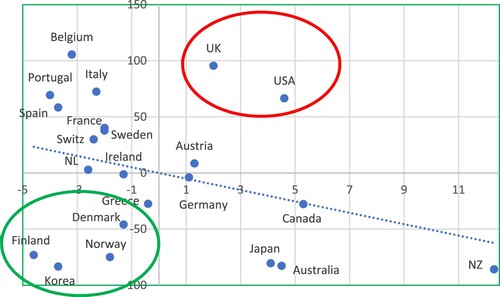
Figure 3. Scatterplot of change in real GDP during 2019–2020 versus cumulative confirmed COVID-19 deaths per 100,000 population.
Sources: data on change in real GDP during 2019–2020 are from AMECO Database; data on COVID-19 mortality are from Johns Hopkins University & Medicine, Coronavirus Resource Centre (https://coronavirus.jhu.edu/data/mortality); data up to February 23, 2021. Notes: (1) the (unweighted) average decline in real GDP for the panel of 22 OECD economies is 6.2%; the figure reports country-wise deviations from this average; (2) the unweighted average cumulative confirmed COVID-19 mortality is 86.4 deaths per 100,000 population for the panel of 22 OECD economies. (3) the estimated linear relationship is negative and statistically significant at 1%.
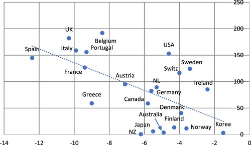
Figure 4. Scatterplot of percentage change in life expectancy (2014-2018) versus cumulative confirmed COVID-19 deaths per 100,000 population.
Sources: data on percentage change in life expectancy at birth (total population) during 2014–2018 are from World Bank’s World Development Indicators (https://data.worldbank.org/indicator/SP.DYN.LE00.IN?name_desc=false); data on COVID-19 mortality are from Johns Hopkins University & Medicine, Coronavirus Resource Centre (https://coronavirus.jhu.edu/data/mortality); data up to February 23, 2021. Notes: (1) the average percentage change in life expectancy at birth (total population) during 2014–2018 was 0.38% for the 22 OECD countries; (2) the unweighted average cumulative confirmed COVID-19 mortality is 86.4 deaths per 100,000 population for the panel of 22 OECD economies; (3) the estimated linear relationship is negative and statistically significant at 1%.
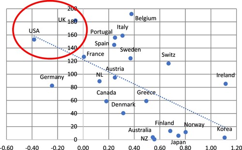
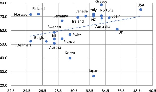
Figure 5. Scatterplot of (after-tax-and-transfer) inequality (Gini) versus cumulative confirmed COVID-19 deaths per 100,000 population.
Sources: Gini-coefficients are from OECD Data (https://data.oecd.org/inequality/income-inequality.htm); data on COVID-19 mortality are from Johns Hopkins University & Medicine, Coronavirus Resource Centre (https://coronavirus.jhu.edu/data/mortality); data up to February 23, 2021. Notes: (1) the average (after-tax-and-transfer) Gini coefficient for the panel of 22 OECD economies is 30.9; the figure reports country-wise deviations from this average; (2) the unweighted average cumulative confirmed COVID-19 mortality is 86.4 deaths per 100,000 population for the panel of 22 OECD economies; the figure reports deviations from this average. (3) the estimated linear relationship is positive and statistically significant at 2.5% (when I exclude the observations for Belgium from the regression).
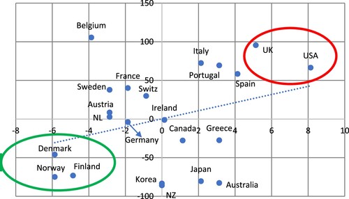
Figure 6. Additional public spending on COVID-19 relief (in euro’s & until January 2021).
Sources: Data on additional public spending, until (January 2021) are from the IMF (Citation2020) October 2020 Fiscal Monitor Database of Fiscal Measures in response to COVID-19; data on GDP and population are from AMECO database.
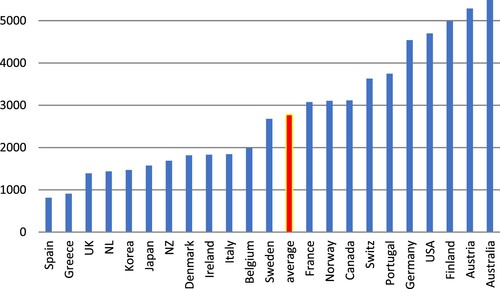
Figure 7. Scatterplot of public debt in 2019 (% of GDP) versus additional public spending on COVID-19 relief (euros per person).
Sources: Data on public debt in 2019 (as percentage of GDP) are from AMECO Database; data on additional public spending, until (January 2021) are from the IMF (Citation2020) October 2020 Fiscal Monitor Database of Fiscal Measures in response to COVID-19; data on GDP and population are from AMECO database. Note: the estimated linear relationship is negative and statistically significant at 1% (when I exclude the observations for the U.S.A. from the regression).
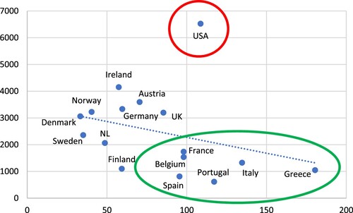
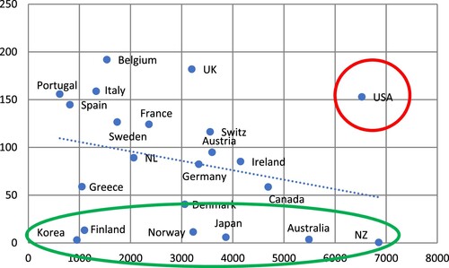
Figure 8. Scatterplot of additional pubic spending on COVID-19 relief (euros per person) versus cumulative confirmed COVID-19 deaths per 100,000 population.
Sources: Data on additional public spending, until (January 2021) are from the IMF (Citation2020) October 2020 Fiscal Monitor Database of Fiscal Measures in response to COVID-19; data on GDP and population are from AMECO database. Data on COVID-19 mortality are from Johns Hopkins University & Medicine, Coronavirus Resource Centre (https://coronavirus.jhu.edu/data/mortality); data up to February 23, 2021. Note: the estimated linear relationship is negative and statistically significant at 2.5% (when I exclude the observations for the U.S.A. from the regression).
Box 1. Austerity and public health policy: the U.K. and the U.S.
Figure 9. Scatterplot of (after-tax-and-transfer) Gini coefficients versus change in real GDP during 2019–2020.
Sources: Data on real GDP are from AMECO Database. Data on inequality (Gini coefficients) are from the OECD (https://data.oecd.org/inequality/income-inequality.htm). Note: the estimated linear relationship is negative and statistically significant at 1% (when I exclude the observations for the U.S.A. from the regression).
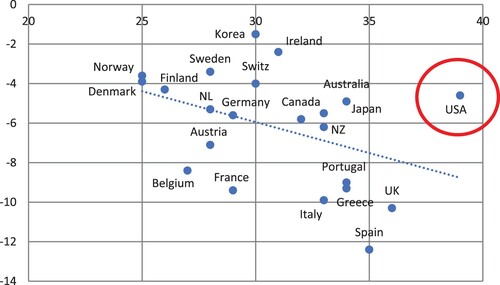
Figure 10. S&P500: stock-market ‘panic’, followed by ‘mania’ (February 2020–February 2021).
Source: S&P Dow Jones Indices, FRED Database. Notes: The index is shown in thousands; rates of growth indicated in the figure are for the respective phase.
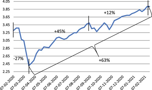
Figure 11. M3/GDP (percentage) and inflation: U.S.A (1970–2020). Panel a: M3/GDP (1970–2020). Panel b: scatterplot of annual percentage change in the M3/GDP ratio and annual inflation (1970–2020).
Sources: Data on M3 and GDP are from OECD Statistics. Data on inflation (measured by annual changes in the Price Index of Personal Consumption Expenditures) are from the Federal Reserve. The estimated linear relationship is negative and statistically significant at 1%.
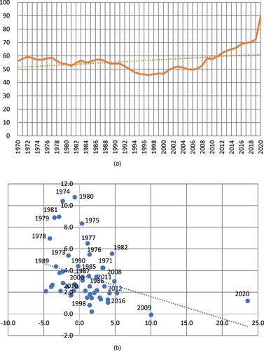
Figure 12. M3/GDP (percentage) and inflation: U.K. (1986–2020). Panel a: M3/GDP (1986–2020). Panel b: scatterplot of annual percentage change in the M3/GDP ratio and annual inflation (1986–2020).
Sources: Data on M3 and GDP are from OECD Statistics. Data on inflation (measured by annual changes in the Consumer Price Index) are from the Federal Reserve. The estimated linear relationship is not statistically significant.
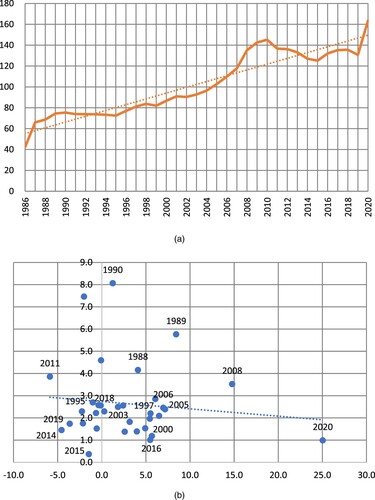
Figure 13. Scatterplot of tax-to-GDP ratio (in 2019) versus the income share of the top 1%.
Sources: Data on the tax-to-GDP ratio in 2019 are from OECD Statistics; data on the income share of the top 1% are from the World Inequality Database. Notes: (1) the (unweighted) average tax-to-GDP ratio is 36.1% for the panel of 22 OECD countries; (2) the unweighted average income share of the top 1% is 11.5% for the panel of 22 OECD economies. (3) the estimated linear relationship is negative and statistically significant at 1%.
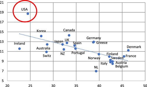
Figure 14. Scatterplot of tax-to-GDP ratio (in 2019) versus the Gini coefficient of (after-tax-and-transfer) income inequality.
Sources: Gini-coefficients are from OECD Data (https://data.oecd.org/inequality/income-inequality.htm); data on the income share of the top 1% are from the World Inequality Database. Notes: (1) the (unweighted) average tax-to-GDP ratio is 36.1% for the panel of 22 OECD countries; (2) the average (after-tax-and-transfer) Gini coefficient for the panel of 22 OECD economies is 30.9; (3) the estimated linear relationship is negative and statistically significant at 1%.
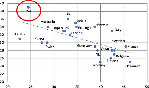
Figure A1. Cumulative confirmed COVID-19 deaths per 100,000 population: February 23 (horizontal axis) versus September 21 (vertical axis), 2021.Sources: see . The estimated linear relationship is positive and statistically significant at 0.1%. The slope coefficient is 1.24.
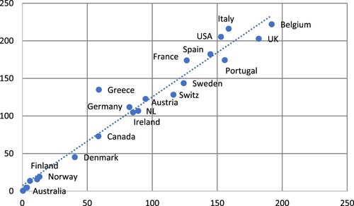
Figure A2. Cumulative confirmed COVID-19 deaths per 100,000 population versus cumulative excess deaths per 100,000 population. Sources: see . The estimated linear relationship is positive and statistically significant at 1%.
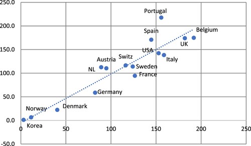
Figure A3. After-tax-and-transfer Gini coefficients versus the proportion of men suffering from overweight and obesity. Sources: see . Data on the proportion of men suffering from overweight and obesity are from Global Obesity Observatory https://data.worldobesity.org/. Note: The estimated linear relationship is positive and statistically significant at 2.5% (when I exclude Japan from the regression).