
Figures & data
Figure 1. This figure illustrates our NFT market analysis framework based on the Ethereum research outlined in this paper.
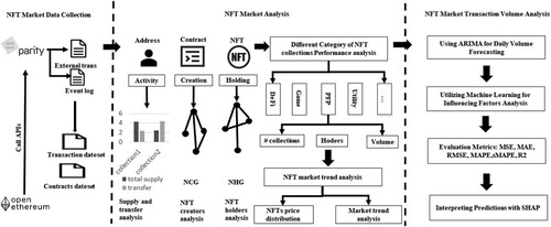
Figure 2. A log of ERC721 NFT transfer event.
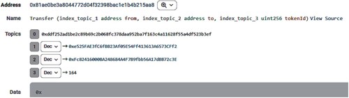
Table 1. Example of NFT transactions dataset.
Table 2. Example of NFT contracts dataset.
Table 3. Description of significant feature Names in the dataset.
Table 4. Number of mint and transfer data in our dataset.
Figure 3. This figure illustrates the distribution of mints and transfers in the NFT market. The x-axis represents the number of NFT collections, and the y-axis indicates the proportion of mints or transfers. Panel (a) presents the distribution of NFT collection mint quantities, while panel (b) depicts the distribution of NFT collection transfer quantities. (a) Distribution of NFT collection mint quantity, and (b) Distribution of NFT collection transfer quantity.
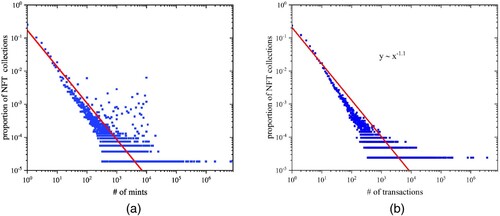
Figure 4. This figure shows the NFT creator features. (a) visualises the NFT Creator Graph (NCG). At the same time, (b) shows the outdegree distribution of the graph, and (c) shows the distribution of the number of Contract Addresses (CA) and Externally Owned Accounts (EOA) by year. (a) NCG, (b) Outdegree distribution of NCG, and (c) CA and EOA accounts by year.
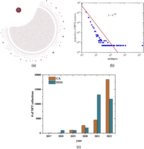
Table 5. Categories of NFT collection creators and the number created.
Figure 5. This figure shows the NFT holder's features. (a) visualised the NFT holders Graph (NHG). At the same time, (b) shows the degree distribution of the graph, and (c)shows the distribution of the NFT collections holders. (a) NHG, (b) Degree distribution of NHG, and (c) Distribution of the NFT collections holders.
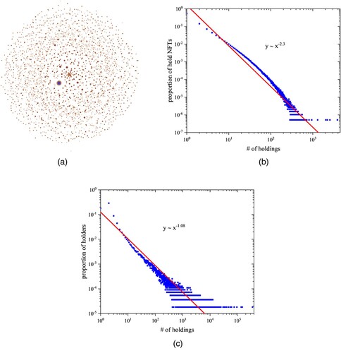
Figure 6. This figure shows the number of NFT holders of each category and the proportion of NFT collections to the total. (a) displays the ratio of NFT collections in each category to the total. At the same time, (b) shows the proportion of NFT collection holders in each category to the total. (a) The proportion of NFT collections in each category to the total, and (b) The proportion of NFT collection holders in each category to the total.
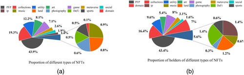
Table 6. NFT category and statistics on the number of collections, holders, and volume.
Figure 7. This figure illustrates the price distribution of NFT transactions and ranks the top 1000 NFT collections based on transaction frequency. In panel (a), we observe the distribution of NFT transaction prices, while panel (b) presents the average and median prices for the top 1000 NFT collections with the highest number of transactions. (a) The distribution of NFT transaction prices, (b) The average and median prices for the top 1000 NFT collections with the most transactions.
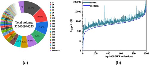
Figure 8. The figure below illustrates the daily transaction prices and total transaction volume trend in the NFT market from January 2018 to April 2022, (a) presents the trend of the daily transaction price and total transaction volume of the NFT market, while (b) displays the logarithm of the daily transaction price and total transaction volume of the NFT market. (a) Daily transaction price and total transaction volume trend of the NFT market, (b) The logarithm of the daily transaction price and total transaction volume in the NFT market.
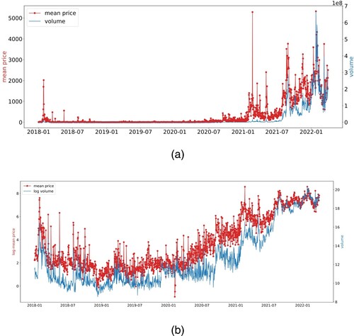
Table 7. ADF test result.
Table 8. Experimental results.
Figure 9. The graph illustrates the daily transaction volume forecasting using the ARIMA model, comparing the actual data and the forecasted values. In Figure (a), both the actual daily transaction volume and the predicted values are presented. Figure (b) displays the 5-day, 10-day, and 20-day moving averages of the predicted transaction volume and the actual 5-day moving average transaction volume. (a) Actual and forecasted daily volume, (b) The figure below shows the 5-day, 10-day, and 20-day moving averages of both the actual and predicted daily transaction volume.
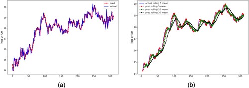
Table 9. Sample the daily transaction volume in the NFT market, with predicted values from ARIMA(2,2,2).
Table 10. Description of features.
Figure 10. The figure compares the fitted plots of the predicted and actual values of the transaction volume of the NFT market by various machine learning models. (a) This figure compares true and predicted transaction volumes to assess the LinearRegression model's fit, (b) This figure compares true and predicted transaction volumes to assess the SVM model's fit, (c) This figure compares true and predicted transaction volumes to assess the CatBoost model's fit, (d) This figure compares true and predicted transaction volumes to assess the XGBoost model's fit, (e) This figure compares true and predicted transaction volumes to assess the RandomForest model's fit, and (f) This figure compares true and predicted transaction volumes to assess the LightGBM model's fit.
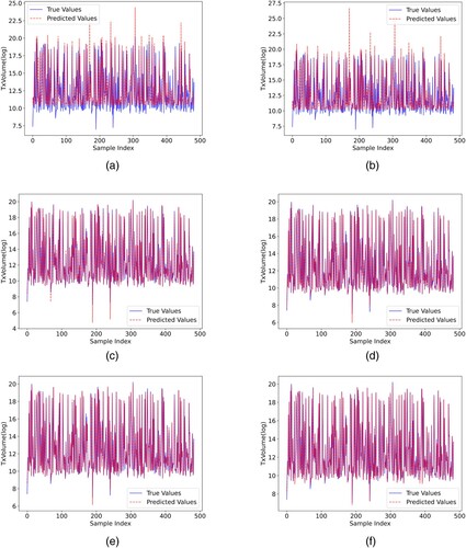
Table 11. Comparison of performance metrics for different models.
Figure 11. This figure shows the relative contribution of each feature to the model predictions when using all features as inputs, with the features ranked vertically by importance from most to least influence. (a) SHAP summary plot of the LightGBM model, and (b) The relative importance of each feature was determined by calculating the average absolute SHAP values.
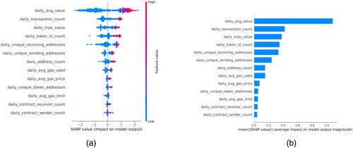
Table 12. Feature contribution scores using SHAP in LightGBM.